


Raphaelle
-
A
- Aurelien
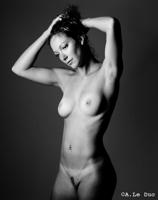
- Equipment Used
- Mamiya RB67 + 127 mm
- Film & Developer
- Rollei Retro 100 Tonal in D76 1+1
- Paper & Developer
- scan
| Photrio.com contains affiliate links to products. We may receive a commission for purchases made through these links. To read our full affiliate disclosure statement please click Here. |
PHOTRIO PARTNERS EQUALLY FUNDING OUR COMMUNITY:  |