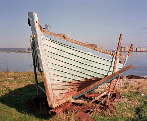


Peedie Lass in Colour
- Location
- Cromarty, Scotland
- Equipment Used
- Bronica ETRSi, 60mm
- Exposure
- 1/60@f16
- Film & Developer
- Fuji Reala 100 (C41 commercially processed)
- Paper & Developer
- Neg Scan(unmanipulated!)
- Lens Filter
- 81b warm-up
| Photrio.com contains affiliate links to products. We may receive a commission for purchases made through these links. To read our full affiliate disclosure statement please click Here. |
PHOTRIO PARTNERS EQUALLY FUNDING OUR COMMUNITY:  |