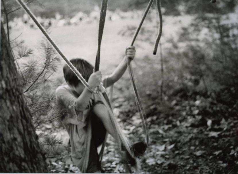
I've been looking through old negatives lately... see if I've overlooked anything. I went right past this when I shot it two summers ago, and perhaps I should have kept it overlooked!! Not sure it works, though his gesture and and movement interest me. Printed it last Monday, and I've been looking at if for a few days, and I'm still undecided. Your comments and thoughts would be welcome. Thanks.
I think it works, Suzanne, but honestly my opinion is that there's too much dead space on the right side. Cropping in closer will make the movement more intense.
I like the movement, it feels like a rush to escape the bright field behind, perhaps to climb into and hide in that pine tree, and that gives it good direction.
Beautiful print values. I love those sparkling highlights.
Thomas... thanks! You've articulated what I apparently could not. I think the framing is what's bothering me about this picture... especially, as you point out, the space to the right. Not sure there's any way to crop it without ripping it to shreds. Thank you!
I like this, Suzanne. The feeling of motion and sense of struggle does make it work. Thomas has a good point about the dead space on the right and you could turn this into a square by playing with the easel blades, or dare I say, scan the negative and see if a digi-burn/vignetting to really get sort of a light-path from left to right (light to dark), before wasting too much paper, can make it work the way it is, crop wise. Certainly has potential.
Photrio.com contains affiliate links to products. We may receive a commission for purchases made through these links. To read our full affiliate disclosure statement please click Here.
PHOTRIO PARTNERS EQUALLY FUNDING OUR COMMUNITY:
This site uses cookies to help personalise content, tailor your experience and to keep you logged in if you register.
By continuing to use this site, you are consenting to our use of cookies.