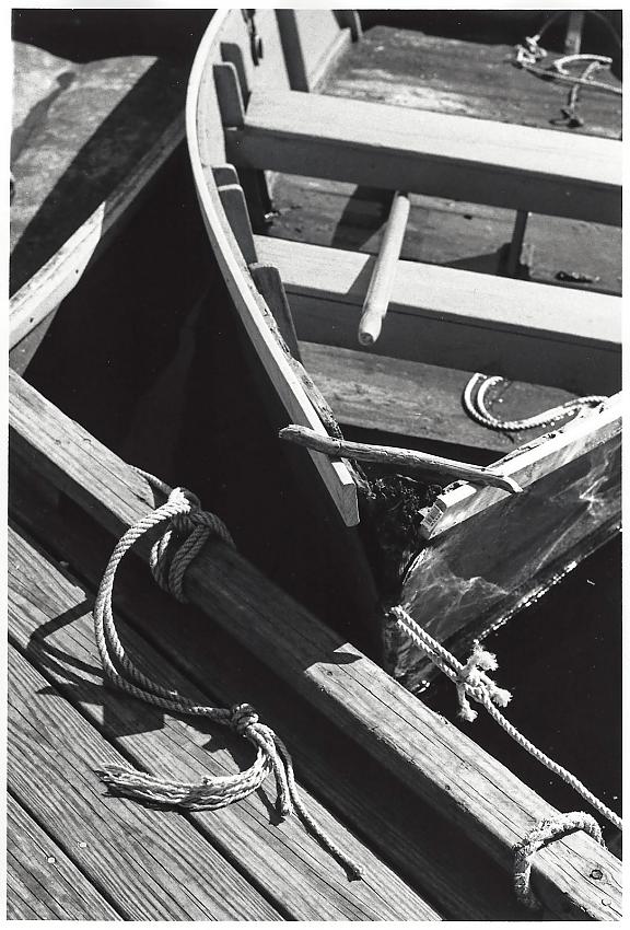
Still being drawn to these types of shots. The balance seems off a bit thought as I wanted the focus to be on the broken tip of the boat and ropes. However, this is in the shade a bit and your eyes are naturally drawn to the lighter areas, which is the back of the boat and is out of focus. Interested in everyone's input.
I agree that burning down slightly the upper light-toned seat would benefit the direction of this image. But that's a minor point...otherwise the composition works for me, here.
Thanks colin and tony I think my biggest issue with this one is my developing was off with the negs. This was my first time trying FP4+ with Ilfosol 3. Ended up getting some extremely contrasty images going by the recommended time. Perhaps I agitated too much? Maybe my thermometer is off? I had to take this all the way down to grade 00. Any higher and I either blew the highlights on the boat or the water was pitch black. Maybe it's time to start experimenting with split grade printing?
This picture as it stands doesn't really work for me because there is one too many elements fighting here. Personally I'd take that left side right angle out, then deal with the story of the broken tip of the boat. I think since you actually mentioned that, that was your visual intent but then the right angle messes that up. I'd crop right down vertically at the edge of the rope, then deal with the exposure issues in printing. The other option I'd do is leave it as it is and burn down that right angle on the left and get rid of it's dominance.
Hmmm, an interesting critique blansky. I had put in that section to add some level of contrast to the scene, hard smooth lines vs. the broken curved lines of the boat. Or at least that's what I was attempting. I certainly spend plenty of time on the docks, so will try a more focused approach next time and see how that works. Thank you
To me the story that can be told here is the free flowing (the boat) vs the dock ( the stationary object here.) The right angle I mentioned sort of fights with the story line. That's why I'd be tempted to crop it. Also just on seeing a few of your various pictures here I sort of see a conflict in what you are doing with some of them. You find interesting things to photograph but you're fighting with what you're trying to say. On the one hand you seem to like abstract objects and on the other you try to tell a story, and I think the two are conflicting you in your message. In my opinion an abstraction is a series of elements that you choose for the viewfinder that are interesting and have movement and compositional qualities but are not "human". They are more like objects. And because of that we treat them like interesting objects. On the other hand in pictures like the boat picture it's more human, it's a human tool, a human made it, it's not abstract, and because of that there is a story to tell. How did the boat get damaged, what happened, the moveable object vs the immovable object. A story. A moral. Something like that. I think you need to define that in your thinking when you make your choices when you take the picture. Am I telling a story, or am I making interesting arrangements. If I'm telling a story, then remove the elements that detract from my story. If I'm making creative angles and lines and form, that's a different exercise. That's why I haven't commented on your driftwood shot yet. I'm still trying to make a determination in what you are telling me. When I look at any picture. I sit there and say to it, "what are you trying to say to me?". The driftwood one still hasn't spoken yet.
...On the one hand you seem to like abstract objects and on the other you try to tell a story, and I think the two are conflicting you in your message...
That's what seems to keep drawing me to this area. I really like the play of shapes, lines, textures, and negative spaces. I guess in the bigger scheme of I want to capture the essence of classic, small Maine fishing port, but am still working out how best to realize that.
blansky said:
...That's why I haven't commented on your driftwood shot yet. I'm still trying to make a determination in what you are telling me. When I look at any picture. I sit there and say to it, "what are you trying to say to me?". The driftwood one still hasn't spoken yet.
No worries about critiquing that one. It was just a shot that I liked when scanning the neg, but the print didn't play out as well as I would have liked. I posted it more just share what I've been up to, which is why I posted it in the Standard Gallery.
No worries about critiquing that one. It was just a shot that I liked when scanning the neg, but the print didn't play out as well as I would have liked. I posted it more just share what I've been up to, which is why I posted it in the Standard Gallery.[/QUOTE]And Blansky, not in the critique gallery.
I really like the composition overall, the interplay of the curved and straight elements. The only thing that is a little jarring to me is the triangular section of water between the boat and the dock, specifically the slight reflection. I am drawn to that reflection. If you burned that in to make it completely black and featureless, then it is all lines, planes and arcs.
Photrio.com contains affiliate links to products. We may receive a commission for purchases made through these links. To read our full affiliate disclosure statement please click Here.
PHOTRIO PARTNERS EQUALLY FUNDING OUR COMMUNITY:
This site uses cookies to help personalise content, tailor your experience and to keep you logged in if you register.
By continuing to use this site, you are consenting to our use of cookies.