


More From The Grove
-
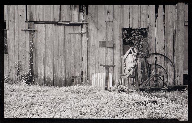
A
- photomc
- Location
- The Grove, TX
- Equipment Used
- Eastman No.2 7x11
- Exposure
- yes
- Film & Developer
- Arista 100, Pyrocat-HD 2.5+2+100
- Paper & Developer
- Fabriano Artistico Extra White, Pld
| Photrio.com contains affiliate links to products. We may receive a commission for purchases made through these links. To read our full affiliate disclosure statement please click Here. |
PHOTRIO PARTNERS EQUALLY FUNDING OUR COMMUNITY:  |