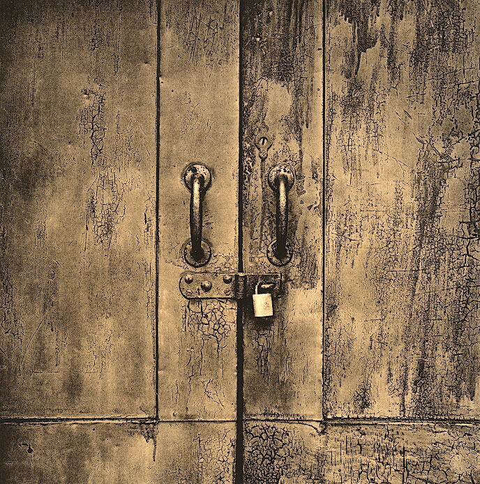
Here is a do-over of a print I have posted before. At first I did not like this version of the image, but now think it is more balanced than the darker version I posted months ago. Just trying to gauge some feedback as it is an image I have included at the tail end of a show I am having at a local coffee store.
This is absolutely amazing Andrew! The detail, the tonality, the highlight on the lock.. all excellent. I would love to see this print in person. Hands down one of my absolute favorites of your work.
Very, very, very nice. I like seeing someone take negative and work with it--This is something that I have really yet to do and I find this print inspiring. Thank you for sharing!
Thanks for the support. I am beginning to prefer this one over my original version that is actually on my APUG portfolio for comparison. I feel this version has a little more sense of airiness and lightness than the moodier darker version.
Photrio.com contains affiliate links to products. We may receive a commission for purchases made through these links. To read our full affiliate disclosure statement please click Here.
PHOTRIO PARTNERS EQUALLY FUNDING OUR COMMUNITY:
This site uses cookies to help personalise content, tailor your experience and to keep you logged in if you register.
By continuing to use this site, you are consenting to our use of cookies.