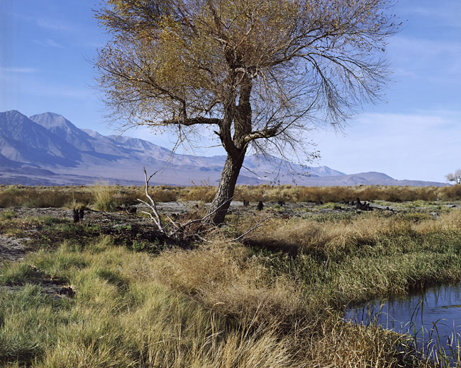


Lower Owens River, 2007
- Location
- Owens Valley, California
- Equipment Used
- Calumet C-1
- Film & Developer
- Fuji 160S
- Paper & Developer
- neg scan
| Photrio.com contains affiliate links to products. We may receive a commission for purchases made through these links. To read our full affiliate disclosure statement please click Here. |
PHOTRIO PARTNERS EQUALLY FUNDING OUR COMMUNITY:  |