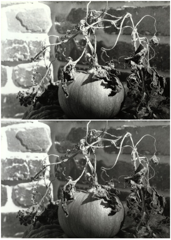


lone pumpkin, hard and soft prints
-
A
- ntenny
- Location
- Poway, CA, USA
- Equipment Used
- Eastman View 2-D (5x7), 215/4.8 Ilex Acuton
- Exposure
- f/32, 8 seconds
- Film & Developer
- Efke 25, HC-110
- Paper & Developer
- Arista .EDU Ultra (Fomabrom Variant) FB VC, Dektol 1+2
| Photrio.com contains affiliate links to products. We may receive a commission for purchases made through these links. To read our full affiliate disclosure statement please click Here. |
PHOTRIO PARTNERS EQUALLY FUNDING OUR COMMUNITY:  |