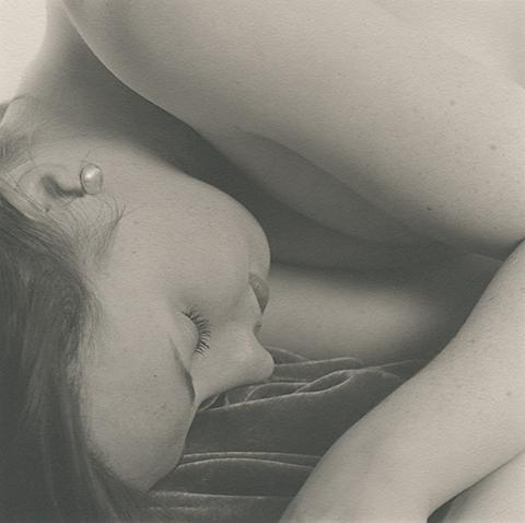
Another from Glimpses of Libby. I posted this a one a while ago, but have since cropped it and worked out how to print it better. The full series is now on my website at: http://www.ianleake.com/gallery.php?gallery=glimpsesoflibbyℑ=071230-02
Wonderful. Very affectionate and endearing. Also intriging how the shapes play off each other. Only crit I have is it feels like flare or fog got to it. I like the high key, but would prefer an ever so slightly cleaner tone, richer black.
I agree, I like the echo of her face in the angle of her arms, so the composition is great. I just wish for a little pop in contrast, not much. Rgds, Kal
I may have to reconsider. Looking at it again, I see how much of the intamcy is coming from that soft almost humid tone . It must be perfect in person. Mr. Leake knows what he's doing.
Thanks everyone. I'm not a big fan of high contrast nudes: they lack sensitivity and I find them somehow aggressive. I know that not everyone agrees with me (OK, I'll be honest - almost everyone thinks I'm nuts!), but I love the gentleness and sensuality that a lower contrast print can portray. So thanks for reconsidering Alden...
Photrio.com contains affiliate links to products. We may receive a commission for purchases made through these links. To read our full affiliate disclosure statement please click Here.
PHOTRIO PARTNERS EQUALLY FUNDING OUR COMMUNITY:
This site uses cookies to help personalise content, tailor your experience and to keep you logged in if you register.
By continuing to use this site, you are consenting to our use of cookies.