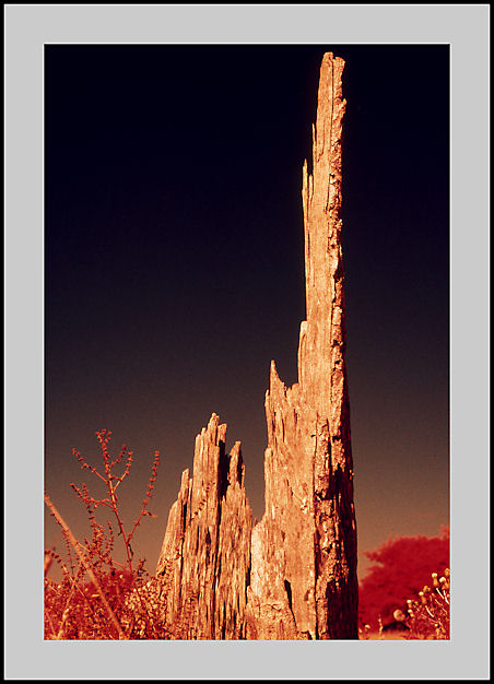
Of the two, this is the more impressive. I think it's the bright red/golden "finger" pointing up into the ever darkening sky and the red foliage. I was never a fan of colour IR compared to B&W. It always looked like a kid had deliberately used the wrong colours in his/her book for just the hell of it but this small pallette of colours works in this scene.
A good comment and one that I can agree with wholeheartly. A friend brought back 4 rolls of CIR when I was expecting HIE. I was therefore aware of the the results that I might get if I was not careful with my compositions. I was happy enough with the results that I achieved and bought a few more rolls to experiment with before the price and availability made it prohibitive. Never the less I have enough shots to incorporate into a mixed photo exhibition that I'm planning for next year.
Photrio.com contains affiliate links to products. We may receive a commission for purchases made through these links. To read our full affiliate disclosure statement please click Here.
PHOTRIO PARTNERS EQUALLY FUNDING OUR COMMUNITY:
This site uses cookies to help personalise content, tailor your experience and to keep you logged in if you register.
By continuing to use this site, you are consenting to our use of cookies.