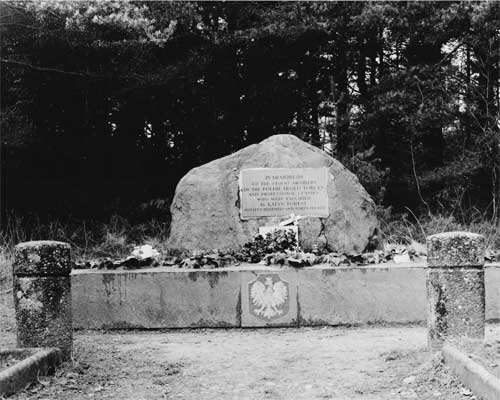
Katyn Memorial
digiconvert

Katyn Memorial

This is a shot of the memorial to the Katyn Massacre.
I would particularly welcome comments on;
-Eveneness of exposure (LHS has been dodged for about 45s)
-Composition
-Grading of print, is it too contrasty ?
General comments also welcome. I am working on a portfolio of work on the Military History/War Memorials of the area and I want to submit this photo. It's probably had the most methodical treatment of any I have as yet produced.

Added text - The inscription reads " In memeoriam to the 14000 members of the Polish armed forces and professional classes who were executed in Katyn Forest
nineteen hundred and forty (1940)" The Soviets blamed the Nazis, everyone else blames the Soviets.
The inscription is clearly legible in the original print

Cheers CJB
Location
Cannock Chase, England
Equipment Used
bronica SQ-B
Exposure
f11 1/15"
Film & Developer
Adox 125/Ilfosol S
Paper & Developer
Ilford MG @ 4
On the print you can clearly read the inscription on the rock, now do that from a wider view of an APS chip size DSLR !
Thanks for your kind comment.
 
I'd like to see the almost black area to the immediate LHS of the rock and level with it lightened a little. If the theme is war memorials then the inscription needs to be clearer/sharper. The wooded background is surely very incidental. Can you get closer to the memorial even if it means cutting out the two small pillars?
 
Wow... this is certainly an emotional subject for me - so first off, thanks for sharing this image. I don't know how detatched I can be in order to offer any technical suggestions, but I'll try (do keep in mind that this is coming from someone who probably couldn't do any better - but perhaps that could be made up for with the benefit of perspective).
The first thing that strikes me abou this image is that you captured a certain solemn mood that has to be the key element for a photo such as this one - so everything else is just gravy, but lets see if we can get some of lumps out of it!
-the upper left, I think, could benefit from more dodging to reveal some detail in the trees as pentaxuser has alrady suggested(if its present on the neg - is it?) I found that sometimes too much contrast will "throw out" my shadow detail - now, I don't think the contrast of this image is in any way wrong, frankly I think its spot on - but you may want to try to trade off some of it in order to help bring out the detail in the trees.
-secondly (or perhaps I should have put this first) - the base of the monument is not parallel to the "horizon" - it seems to be tilted about 3-4 deg with the right hand side being higher than the left (perhaps this is reinforced by the "weight" of the dark area on the left as well). Its a small deviation, but just enough to make the visual impact a little bit less. I think the small crop needed to correct this would be well worth it - having that base dead-on horizontal would make this a lot more striking right off the bat.
Well, that's it for suggestions - once agan, thanks for sharing this image, I would love to see more (being Polish, I would love to see the monument in Northolt - you're closer than I am!),

Peter.
 
Thanks to all for the comments, methinks another session is called for.
 

Media information

Category
Critique Gallery
Added by
digiconvert
Date added
View count
514
Comment count
5
Rating
0.00 star(s) 0 ratings

Image metadata

Filename
katyn.jpg
File size
34.1 KB
Dimensions
500px x 400px

Share this media

Photrio.com contains affiliate links to products. We may receive a commission for purchases made through these links.
To read our full affiliate disclosure statement please click Here.

PHOTRIO PARTNERS EQUALLY FUNDING OUR COMMUNITY:


Ilford ADOX Freestyle Photographic Stearman Press Weldon Color Lab Blue Moon Camera & Machine
Top Bottom