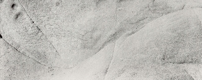
I read once that a panorama must read like a story. It has to have a beginning a middle and an end. In each of these images I find myself wondering what is outside the frame, and where the rest of the story is? The printing is nice and the texture is nice but I am just not seeing anything very strong in the image.
I am curious to know where you read that about panorams, and who said it. It sounds like a rule, and I have been brought around to belive there are no rules. A good photograph should have no end, or beginning for that matter. But it should simply be a thing in itself. A picture is not a story, and a photograph is just a thing, a physical object.
Though I have heard of "photographs being rythmic events." I take that to mean that there are visual tensions that cause you to move and feel, all taking place in one instant, in one thing. Stieglitz, so many years ago said, "Nothing must be left unconsidered, there must be a complete release." I believe it still holds true.
There are things outside the frame, in these 3, as well as every other picture in the world. But that which is outside is there for a reason, it has no relavence to what IS in the picture. I put what is in the frame IN because that is what I was concerend with.
I am confused with what your meaning of "strong" is. If it is a grand(ious) landscape with waterfalls and dark skies, then this is not it. But that is not my meaning. If something is not visualy strong it will not hold up and I would not print it.
As for these pictures being panoramas, they are not, and were not made with such intention. True they are elongated, but more in a fashion of banquet cameras, having compressed vertical space.
I wonder what you would think of this if it were of a nude?
Thank you Suzanne for that comment. I am incredibly pleased that you felt the subtleties in the picture. I believe that somthing like this can be just as elegant as a picture of a piece of abandoned desert shack, or a mountain landscape. It all has to do with how it is seen and felt.
Hi Jim, before I comment on the K2 I want to say that the Azo print you sent to Michael and Paula (a while ago) is very, very nice.
The K2 used at Joshua Tree (especial on the flat granite rocks) always seems to make it look better. I have photographed there a lot, and learned that is what you use when the sun is out (on grey days I often used a dark green filter. There is a purple in some of the rocks that will nicely seperate). I would say it is due to the darkening of all the tiny shadows cast by the corseness of the granite, very important is the seemingly flat midday light. I have used a red and orange, but the yellow filter seems to be the best.
Photrio.com contains affiliate links to products. We may receive a commission for purchases made through these links. To read our full affiliate disclosure statement please click Here.
PHOTRIO PARTNERS EQUALLY FUNDING OUR COMMUNITY:
This site uses cookies to help personalise content, tailor your experience and to keep you logged in if you register.
By continuing to use this site, you are consenting to our use of cookies.