Jane
marktweedie

Jane

I am posting this for two reasons: 1) I want to know what you think (!) 2) as an example of a point raised in the current thread in the forum about why we don't offer critiques of others' work very freely http://www.apug.org/forums/showthread.php?t=33910

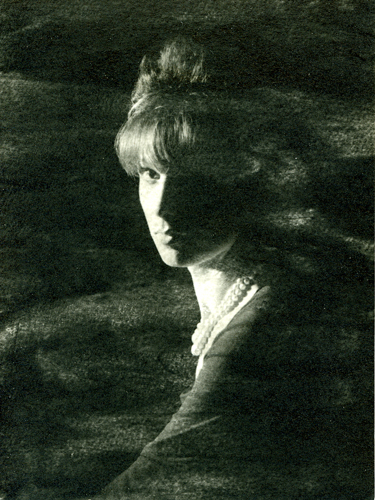
My intention in making this photo: a) to portray the sophisticated and elegant nature of my model Jane and to render on film/paper some of the 'atmosphere' of her personality. b) to reinforce this technically by choosing liquid emulsion on watercolour paper rather than standard photo paper.

I would appreciate your comments on whether my technique is sufficently well executed to reinforce my intention and whether the choice of medium adds to or detracts from the image as a whole.

Thanks,
Mark
Equipment Used
Bronica S2A 75mm Nikkor-P
Film & Developer
APX100 in Rodinal
Paper & Developer
Liquid Light and watercolour paper
I think the choice of a mixed media works quite well here, it is a portrait with a difference. The lighting you have chosen has resulted in quite high contrast and in the repro here the model's left eye has been completely lost, this may not be the case in the original. I am a little undecided whether seeing some detail in the eye would add anything to the image.
The original, on watercolour paper, would be a delight to see. I would say that the effect has certainly added a sense of mystery to the portrait.
Thanks for sharing your ideas and It seems an avenue worthy of further exploration.

John.
 
Interesting picture, I like the mystery created by the shadows and missing anatomy. Not too sure about your technique, I would really need to see the original print, to make a proper evaluation.

Mick.
 
The face is cut exactly in two almost like a mask. As long as this was your intention then it works. Showing any detail in the dark side of the face destroys this aspect. It also gives it a ghostly effect. It's almost as if this is not a real person. I'd need to see the print as opposed to a scan but I suspect it works. There's also something more here in the darkness provided by the liquid emulsion than a simple vignette effect could achieve on photopaper.

A straight print on photo paper couldn't be a substitute.

If this was a straight substitute for paper then why bother?

I think it works
 
Don't really like the swirly stuff. Reminds me people trying to affect a pose with "distressed jeans." Does not match well the the elegance otherwise.
 
Hm... I think I kinda like the swirly stuff...(maybe next time a little different pattern?)... when I saw the thumbnail, it made me think of fog or smoke. I also like the dark side of the face having no detail, and the lines created by the light side of the face. I'd like to see it a little less blown out around her necklace, but it could just be the scan. Interesting!
 
Looking at the face, hairstyle and pearl necklace I think I see the elegance you referred to. What comes across to me is a slightly aloof and aristocratic gaze which is incompatible with the dark and brooding character of the swirling treatment. So I don't think it really augments the subject that well. Its "feels" like the backdrop for the face should be the library of a stately manor but the swirling treatment is evoking a walk through a foggy moor. I think after a while the hard contrast and lack of detail in the shadows on the face would start to grate.
Thanks for sharing and seeking honest feedback. I enjoyed evaluating and thinking through my response to this unusual image.
 
I have to concur with Tony on this. The lighting is very interesting but I feel that the swirly effect just distracts from what could have been a very strong image.
 
First, my reacton, aesthetically - file this under "What do you think", although "feel" would be much closer: There is a great deal of impact here ... demanding attention, and that is not usually found in portraiture. Once over this intital shock, I "see" a fascinating woman. To me, it does "work".

Now the rest ... to stay within the parameters suggested, I'll "deconstruct" and try to address my critique point by point:

a. "To potray the sophisticated and elegant nature of my model..." I think you HAVE done that. ".... To render on paper some of the atmosphere of her personality -" I'm not sure that "personality" has an "atmosphere"... but I think I understand the question. I cannot tell if you have been successful here - I could not answer this without some knowledge of her personality.

b. "To reinforce this tehnically by choosing liquid emulsion on watercolor paper..." I cannot comment here, either. The only "media" I have for any crtique is a glass screen in front of this keyboard.
 
For me, I feel the "sophisticated and elegant" part of her persona you are trying to portray is at odds with another sense of something more "ethereal". As a viewer, I don't think this matters, in fact it adds an air of mystery and tension, with layers of meaning/possible interpretation, which I like very much. Whether that's quite what you wanted, though, I'm not sure....
btw in making a response it really does help to have an idea of what you were trying to achieve, thanks for that.
Cate
 
The lighting on the face succeeds in portraying elegance. The dark clothing and background, and the effect introduced by the watercolor paper, masks identifyable detail that would only distract from the face. Well done.
 

Media information

Category
Critique Gallery
Added by
marktweedie
Date added
View count
831
Comment count
11
Rating
0.00 star(s) 0 ratings

Image metadata

Filename
311.jpg
File size
209.3 KB
Dimensions
375px x 500px

Share this media

Photrio.com contains affiliate links to products. We may receive a commission for purchases made through these links.
To read our full affiliate disclosure statement please click Here.

PHOTRIO PARTNERS EQUALLY FUNDING OUR COMMUNITY:


Ilford ADOX Freestyle Photographic Stearman Press Weldon Color Lab Blue Moon Camera & Machine
Top Bottom