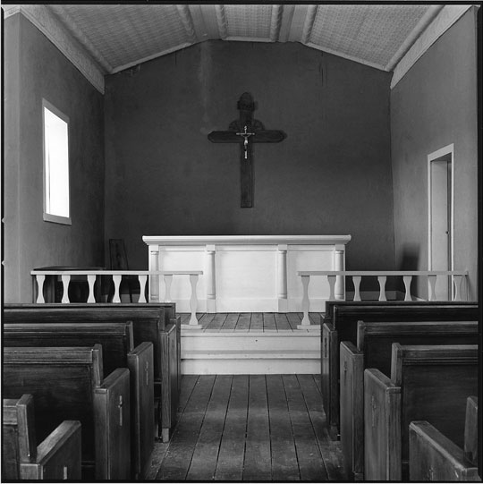
Great range of tones.... Nice job keeping distortion out of this image (there was a potential for converging vertical lines). could you have burned the window a little more??? Overall, I like the way you've managed this image.
this is a scan of the actual print and doesn't come close to what it really looks like.
as for the window, it is blown out but that is what it really looked like.
David, I like it, I like it a lot. The local contrast is great, specially between the balustrade and the altar, is so subtle. My only concern is the high key of the window, don't know, but makes me feel some unbalance in the composition.
I like this print. A lot of prints are black white and shades of grey. This print has some meat to it. Fat, rich, creamy, full of texture, Brett would be proud of you.
Photrio.com contains affiliate links to products. We may receive a commission for purchases made through these links. To read our full affiliate disclosure statement please click Here.
PHOTRIO PARTNERS EQUALLY FUNDING OUR COMMUNITY:
This site uses cookies to help personalise content, tailor your experience and to keep you logged in if you register.
By continuing to use this site, you are consenting to our use of cookies.