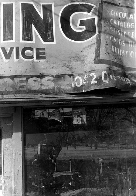
This one was a last minute choice for my exhibit in April. I liked the ambiguous wording the framing gave, and someone must create a museum for all of these old hand-painted banners. They deserve more than being left alone to crumble, yet another analog art falling into disuse.
I like this very much. Really nice abstraction.
And I feel the same way regarding history and/or art being covered over and torn down.
They painted over a 'Mathew Brady(s) studio' sign on the side of a building on lower Broadway in NYC not too many years back because the new residents didn't like answering the occasional question about it. True story.
There's a deliberate apeing of Walker Evans here--see the other pictures I've posted today to prove that I'm incapable of an original idea.
Walker Evans's Polaroid probably taught me more about vision and composition than any other photos I've ever seen. It's one of the few photo books to which I had a visceral reaction, not just the "oh, isn't that interesting" type of reaction! And who can mistrust the gut?
yes, really nice Michel! Though personally I wish the bottom was cropped a bit.. but that's just me. I'm a princess that way (!). Anyway- I'm not sure if I agree with the walker evans comment so much though. He DID make photographs that included signage... and I think he, like you, was interested in the graphic aspect of the signage... but I feel this photograph is far more similar to an aaron siskind photo, in most aesthetic ways.
Photrio.com contains affiliate links to products. We may receive a commission for purchases made through these links. To read our full affiliate disclosure statement please click Here.
PHOTRIO PARTNERS EQUALLY FUNDING OUR COMMUNITY:
This site uses cookies to help personalise content, tailor your experience and to keep you logged in if you register.
By continuing to use this site, you are consenting to our use of cookies.