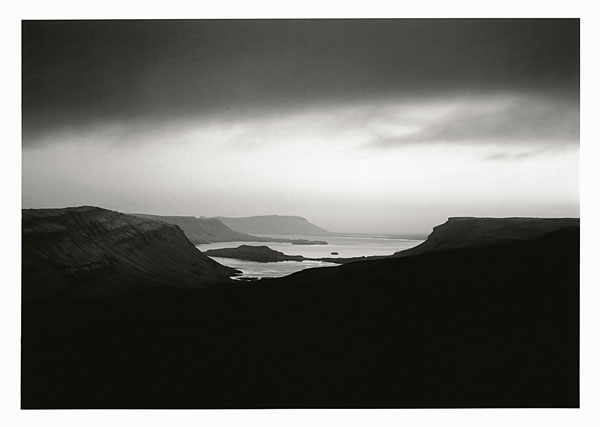
A "strong" photograph. I would try for a more gradual transformation between the lightness of the horizon and the darkness of the sky at the top of the image.
Beautiful! The only thing I would say would be to maybe crop a bit off the bottom. With the longer aspect ratio it becomes more dynamic, I think. On my screen, covering up about the bottom 5/8-3/4" makes it stronger.
Very beautiful and serene. The darkness works to lead the eye to the center but I would like to see just a little more detail in the dark area near the center, assuming it is on the negative.
Absolutely Striking !!! Gorgeous Image, I'm impressed, as most of this style of your landscapes are very alluring and serene in a very dynamic confluence of Sky, Earth and Sea. Makes me want to pack and check tickets to Iceland.
It is true that I have very high standards, and that is why most of my comments seem "negative", "degrading" or "masochistic". They all are put forth with every intention of being helpful. That is why they are all very long-- maybe the lengthiest critiques regularly given on Apug.
-----------
Is was made to the South West or North East of Reykjavik?
This picture is quite close to being "right on". The top left and right edges are exactly where they need to be, but the does need to be cropped (if you are willing to do so, or you could just dispose of the negative and learn from the experience). The reason for cropping (which is lacking in the above suggestion to crop-- "makes it stronger" is not sufficient) is the shape of the clouds and the shape of the dark foreground do not relate to each other, and are not completing a sort of spiral/oval movement. As it is now, the bottom of the picture is too heavy, which is partly due to tonal reasons. Because the bottom shape takes up too much space, and because it is too dark you don't really get a feeling of the motion within the picture (it does have the potential). The foreground, being so dark causes the picture to have a dead weight that is hard to get out from under. Lightening it will cause it to relate even more with the clouds at the top. It is possible that simply lightening it will solve the problem and you would not have to crop.
Did you consider the space on either side of the lake? The left side is a little unbalanced in relation to the right. Panning the camera left a 1/4-3/8 of an inch would have solved that.
In this case, the non-level horizon does not enhance the composition. It is a little hard to tell here, but it is very apparent in the thumbnail.
Photrio.com contains affiliate links to products. We may receive a commission for purchases made through these links. To read our full affiliate disclosure statement please click Here.
PHOTRIO PARTNERS EQUALLY FUNDING OUR COMMUNITY:
This site uses cookies to help personalise content, tailor your experience and to keep you logged in if you register.
By continuing to use this site, you are consenting to our use of cookies.