


HELP, better contrast
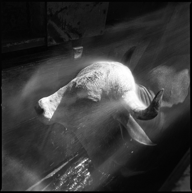
- Equipment Used
- Hasselblad 500 CM, 50 mm lens
- Exposure
- f/8 @ 1/60 sec
- Film & Developer
- Ilford XP2, C41
- Paper & Developer
- neg scan
| Photrio.com contains affiliate links to products. We may receive a commission for purchases made through these links. To read our full affiliate disclosure statement please click Here. |
PHOTRIO PARTNERS EQUALLY FUNDING OUR COMMUNITY:  |