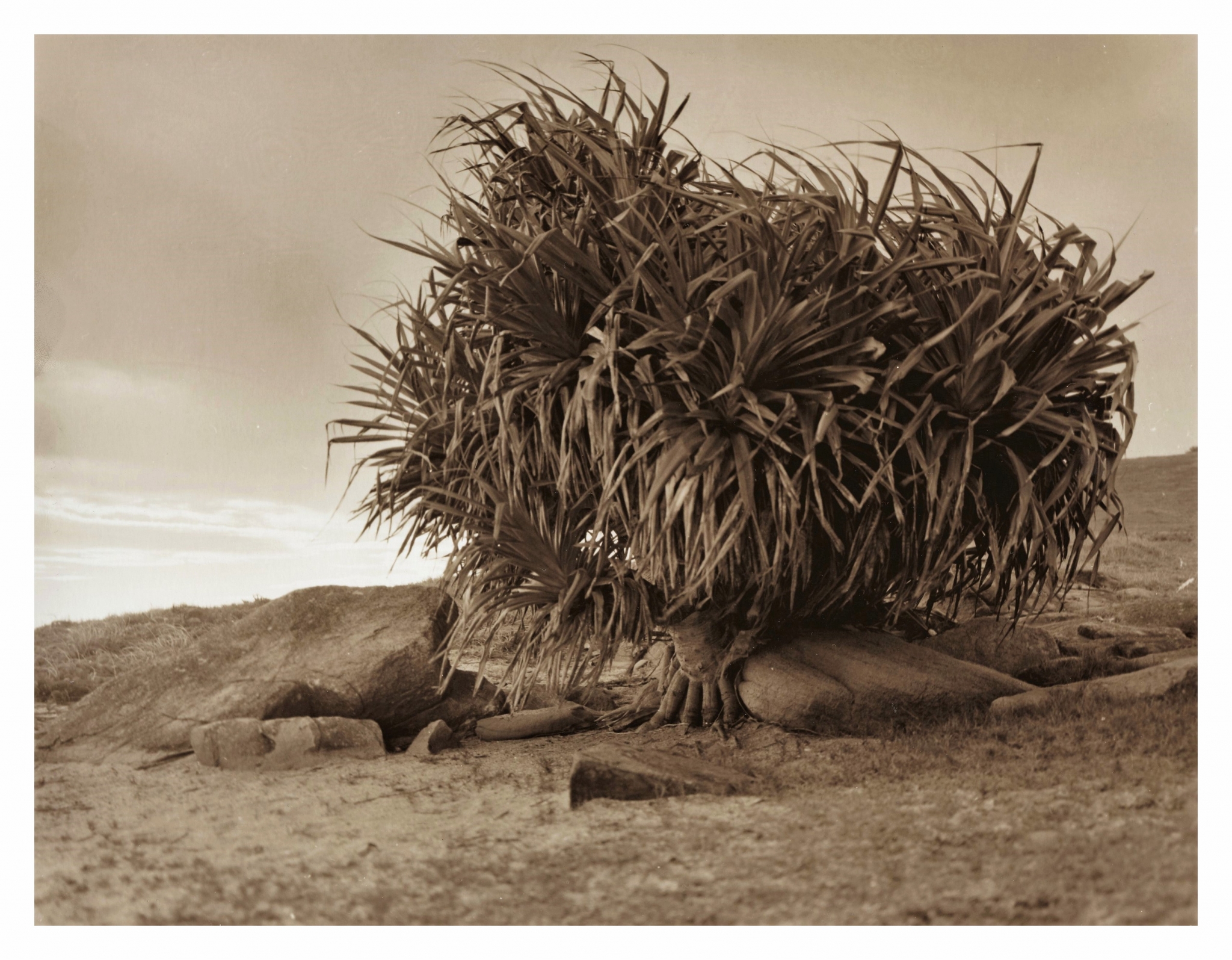


Headland Tree in Sepia
-
A
- awty
- Location
- Yamba Point
- Equipment Used
- Veruca (mamiya rz67) 90mm lens
- Exposure
- f5.6
- Film & Developer
- 120 acros 100 in d76
- Paper & Developer
- 8x10 foma classic warm tone fcvc, selenium then sepia
- Hybrid Materials & Processing
- scan and tidy up.
| Photrio.com contains affiliate links to products. We may receive a commission for purchases made through these links. To read our full affiliate disclosure statement please click Here. |
PHOTRIO PARTNERS EQUALLY FUNDING OUR COMMUNITY:  |