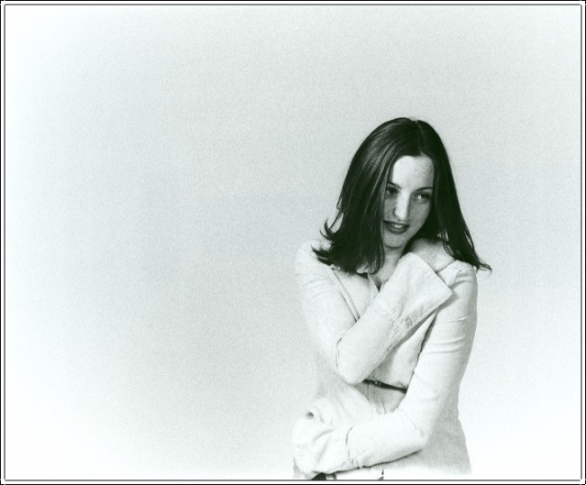
Happy Accident
mikepry

Happy Accident

I messed up on the dilution ratios and got some nasty grain...but is it? I like now after living with it for a couple days.
Location
Salem, WI (my garage)
Equipment Used
N-80 w 28-80 Tokina 2:8
Exposure
f/8 with lights
Film & Developer
FP4 Plus and whoops, wrong dilution, Ilfotec HC
Paper & Developer
Ilford Multigrade RC Pearl
Looks good to me. I don't see any particularly hevy grain.
 
Mike,

I like the grain too. It seems to add to the overall effect of this image. I wonder what the model was thinking at this moment?
 
Grace...I'd like to know that to. She wasn't really comfortable at first but after awhile I think she calmed down a little. That's another aspect of portraiture that isn't discussed as much as it needs to be. We have the technical (ugh), the artistic and the interplay between subject and photographer. Getting the subject to relax and drawing out the emotion that one wants to either create or in this case show the emotional side that's already there and perceived by the photographer. I find it amazing that this is IMO overlooked grossly.
 
I'd like to see less fall off of the image towards the corners. Or are you trying to vignette this image?

My guess is an enlarging lens that doesn't cover well or enlarger that falls off...

Have you toned this image? It looks like there is a slightly cool bias to the tones.

joe :smile:
 
Mike,

I bet I know what she was thinking. "I'm so glad I have black hair." That was probably it. I would love to have black hair. She's so lucky!
 
It is good portrait and you show her expression and her feeling very well, but the position of the light is casting a shadow across her face. It almost makes it look a like a Picasso.

I don't know if she appreciates that.

Grainy? It just looks 35mm to me . . .

Why is ther so much space on the left? It makes her look like she does not want to even be in the picture. If you are going to give that much space at the top you really need to give more space on the right.

There is a hot-spot on her forehead and nose that needs to be burned down. she should be burned in from the waist down also.

The print color is not very nice for the subject. Maybe something more pink (selenium toning), or at least something marmer, like Ilford warmtone.
 

Media information

Category
Critique Gallery
Added by
mikepry
Date added
View count
1,472
Comment count
9
Rating
0.00 star(s) 0 ratings

Image metadata

Filename
463grace_2-med.jpg
File size
184.5 KB
Dimensions
650px x 538px

Share this media

Photrio.com contains affiliate links to products. We may receive a commission for purchases made through these links.
To read our full affiliate disclosure statement please click Here.

PHOTRIO PARTNERS EQUALLY FUNDING OUR COMMUNITY:


Ilford ADOX Freestyle Photographic Stearman Press Weldon Color Lab Blue Moon Camera & Machine
Top Bottom