-
Welcome to Photrio!Registration is fast and free. Join today to unlock search, see fewer ads, and access all forum features.Click here to sign up
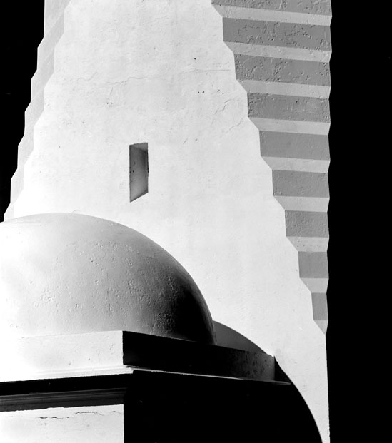


Greencape lighthouse detail
- Location
- Green Cape, far south coast of N.S.W. AUSTRALIA
- Equipment Used
- Hassy 500c, 150 sonnar
- Exposure
- 1/60th @ f11
- Film & Developer
- Pan F, Rodinal 1:50
- Paper & Developer
- Ilford MC Fibre, D72
- Lens Filter
- orange
| Photrio.com contains affiliate links to products. We may receive a commission for purchases made through these links. To read our full affiliate disclosure statement please click Here. |
PHOTRIO PARTNERS EQUALLY FUNDING OUR COMMUNITY:  |