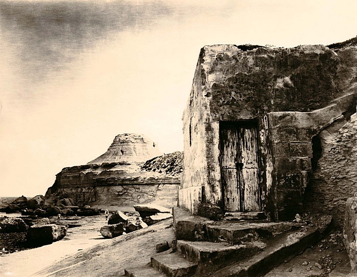
I'm not one who likes the litho prints that are so bleached out. your other print is really nice but I guest I don't get this over bleached, blown out highlights, on a I think really nice image.
Thanks for all the comments. This was accidentally overdeveloped and I was attempting a bleach and redevelopment job on the print. When I saw the partially bleached image I rather liked it. It reminded me of a charcoal drawing so I stopped the bleach and refixed it instead. This is the result.
A more conventional version (from a different negative) is here:
http://www.apug.org/gallery/showphoto.php?photo=37151&ppuser=8180
A charcoal drawing was what it reminded me of. It has its value and I suppose it depends on how far the viewer appreciates a scene departing from photo-realism.
You could just as easily argue that the Fotospeed sepia version is as far removed from what the scene actually looked like but that one appeals to the more conventional view of what a toned print should look.
I'll have to put myself in the more conventional category this time.
Photrio.com contains affiliate links to products. We may receive a commission for purchases made through these links. To read our full affiliate disclosure statement please click Here.
PHOTRIO PARTNERS EQUALLY FUNDING OUR COMMUNITY:
This site uses cookies to help personalise content, tailor your experience and to keep you logged in if you register.
By continuing to use this site, you are consenting to our use of cookies.