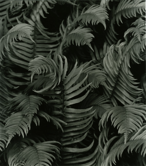
Stopped me in my tracks...
This is one of a working prints of this image, and I'm not sure yet what directions I want to go with it, but I'd love to hear people's feelings about the image. It looks a bit darker on my screen than in print...
I think this would benefit from a dark and moody print to enhance the patterns. On my monitor it looks about right, maybe burn the edges a little to enclose the image. Contrast looks about right, very nice indeed.
Thanks for all the kind comments.
A darker, contrastier print of this was my first instinct, and I have a couple that I really like. Perhaps I'll post one for comparison the next time I'm near a scanner. This print was a bit of a surprise, I didn't expect to like the lighter version of it as much as I do.
I've never tried bleaching, but I'm interested in experimenting with it. I'll have to search the archives here for a little more info.
The Nuance paper has challenged me, but sometimes I get something right, and boy do those midtones just sing!
Photrio.com contains affiliate links to products. We may receive a commission for purchases made through these links. To read our full affiliate disclosure statement please click Here.
PHOTRIO PARTNERS EQUALLY FUNDING OUR COMMUNITY:
This site uses cookies to help personalise content, tailor your experience and to keep you logged in if you register.
By continuing to use this site, you are consenting to our use of cookies.