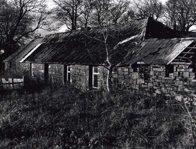
Well, since this in the critique area, I'll make some comments.
I don't like anything about this picture. It's too contrasty. The foreground is way too prominent and is utterly unintersting - just a bunch of tangled brush. The bldg is not very interesting and the composition is banal.
You may be new to photography so don't take this too harshly if you are. When I started out, I got black grass and pure white skies.
One thin to take into consideration with a subject like this is it's inherent complexity as a subject. There are MANY elements to this picture. What you should try to do with this subject is ask yourself what it is that makes this thing interesting and unique. Why are you drawn to taking a photograph of it? When you can answer that, you can then isolate that particular element of the scene in the photograph.
I suggested this to a man once, and I asked him what drew him to the the subject matter so I could help him narrow down a complex scene. He said he felt like it was a 'wonderland' or something like that. I told him there was no 'wonderland' there and you can't photograph concepts and dream images - stick to reality (yes I know of Ulesman). If you can concretely decide what interests you, then move in closer and make that the subject of the photograph and the photograph will work if it captures whatever that is. But what you have here is really a jumble of stuff not well composed and really doesn't show anything well.
Old photographers always chided their students to 'move in closer' and what they meant was to isolate parts of a subject and distill it down to fundamental elements.
One think I used to do with a view camera was to carry an 8x10 gray card with a 4x5 hole cut out and I'd walk around composing many diffferent angles and moving the card various distances from my eye to simulate different lenses. When I got what I wanted, I'd drop the card on the ground and setup my tripod right there.
When I composed with the card, I would always include a few elements of the subject as possible and them move the card and add in one more thing at a time until it got too busy and then I'd back off. It really helped me learn how to isolate a scene.
Thanks for the comments, the high contrast was intended to show off the white window frames. I did do some detail shots and agree that this one is "messy", problem is that they all look a little too grey in my opinion. I'll post one
Photrio.com contains affiliate links to products. We may receive a commission for purchases made through these links. To read our full affiliate disclosure statement please click Here.
PHOTRIO PARTNERS EQUALLY FUNDING OUR COMMUNITY:
This site uses cookies to help personalise content, tailor your experience and to keep you logged in if you register.
By continuing to use this site, you are consenting to our use of cookies.