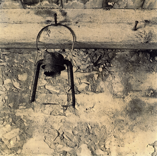
I had a straight print of this up a few weeks ago that didn't seem to impress anyone. But the same thing that compelled me to take the picture in the first place made me want to invest some more time into it.
The image has great potential that just hasn't been fully reached yet. The light areas on the bottom -- especially the lower right -- keeps my eyes in the lower half of the image. It keeps me from seeing the image as a whole.
You might consider flipping the negative and printing backwards. Take the print and stand in front of a mirror and check it out. I just checked it out with a handheld mirror and the composition seemed to be stronger...but the proof is in the pudding, as they use to say.
ILFORD PQ UNIVERSAL is a liquid concentrate dimezones/hydroquinone developer. I have been using it for film, but it is primarily a paper developer that has had the metol replaced with 4,4-dimethyl-4-methyl-1-phenyl-3-pyrazolidone, or something of that nature.
It suppose to yield warmer prints, but I was surprised at the yellowish sepia tone-ishness of the print. The color on my monitor is quite nice...different, but it does make the highlights glow.
Photrio.com contains affiliate links to products. We may receive a commission for purchases made through these links. To read our full affiliate disclosure statement please click Here.
PHOTRIO PARTNERS EQUALLY FUNDING OUR COMMUNITY:
This site uses cookies to help personalise content, tailor your experience and to keep you logged in if you register.
By continuing to use this site, you are consenting to our use of cookies.