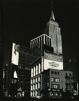
I am no stickler for having straight vertical lines appear straight in an image but I think in this case it would have helped. As it is, the whole picture appears to lean to the right a bit and feels unnatural. What I really like is the configuration of matching cream tones in the top and bottom of the Gap sign, the front of the middle building and it's sign, the second tallest building and the top of the ESB tower. Plus the little bits of it around the bottom. I think a bit more detail in the shadows(I don't know anything about the polaroid type 55 and if that is possible) and the correcting of the verticals would have made this image much better. All the best. doc
Photrio.com contains affiliate links to products. We may receive a commission for purchases made through these links. To read our full affiliate disclosure statement please click Here.
PHOTRIO PARTNERS EQUALLY FUNDING OUR COMMUNITY:
This site uses cookies to help personalise content, tailor your experience and to keep you logged in if you register.
By continuing to use this site, you are consenting to our use of cookies.