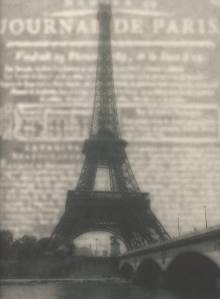
Eiffel Tour 2
Jersey Vic

Eiffel Tour 2

I took an old negative with a very blown out sky and printed it (diffused by wax paper 1/2 the exposure) twice, once with a '120' paper negative and once with a '120' paper postive that I made on my laserjet from the image of an old newspaper I found on ebay.

I'm trying to decide:
Does it work?
If so, which is preferable?

Thanks

Victor
Location
Paris
Equipment Used
Leica III a Summaron 35mm lens
Exposure
Sunny f16
Film & Developer
TriX
Paper & Developer
Kentmere Fineprint VC warmtone, a 1 minute dip in 1:200 polytoner and then 'toned in the wash' for a 1/2 hour
Vic, i like this one better, there's more definition in the bridge and the darker sky/newspaper gives it an almost WWII feeling. Well done on both of the them.


jan
 
Thanks Jan - Agreed; whereas the 1st has a 1900 feel, the dark background evokes WWII and I can't place why..sheet music covers of the time maybe?
Update-You think I'd would remember after watching "Rocky Horror last week-it looks like the old RKO Studio promo before their films
Victor
 
victor

i can't decide.
i really like both images for different reasons.
i like the other one because the dark type works well with tones of the tower and bridge, and i like this one because the white type really gives a 3d feeling to the image ... can't explain it ..

ciao
john
 
I really like this one, but I can't say why. They are both beautiful, I just keep coming back to this one.
 
Firstly, let me say that I really like this picture.

This one is certainly the better of the two becasue the tones and the structure. In this one the tower is leaning slightly to the right (it may have been an error in printing- but an error in favor of you) and adds a bit of movement, white the variations in tones of the newspaper do the same thing-- bring you back to the left. The softness also gives a good feeling, something that is subjective, but still nice.

People might say that I have over analyzed the picture, and that can destroy the beauty of it. But, having an understanding of the structure and the physicality of the picture does not. in any way, detract from my enjoyment-- and if anything, might make the enjoyment greater.
 
on a second look, the tower might only seem to be leaning to the right becasue of the dark strip on the left edge of the other picture. Regardless, this one is still better.
 

Media information

Category
Critique Gallery
Added by
Jersey Vic
Date added
View count
497
Comment count
7
Rating
0.00 star(s) 0 ratings

Image metadata

Filename
eiffel-2.jpg
File size
117.2 KB
Dimensions
442px x 600px

Share this media

Photrio.com contains affiliate links to products. We may receive a commission for purchases made through these links.
To read our full affiliate disclosure statement please click Here.

PHOTRIO PARTNERS EQUALLY FUNDING OUR COMMUNITY:


Ilford ADOX Freestyle Photographic Stearman Press Weldon Color Lab Blue Moon Camera & Machine
Top Bottom