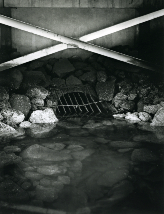
Dockside Sewer

Dockside Sewer

My first print from negatives made on the inaugural meeting of the Nanaimo Large Format and Traditional Photography club (also known as a get together with Lillian and I). This shot let me have fun with my tilt and swing to try and get everything in focus and get the center of the crossbars over the sewer grate.

Original was on Ilford Multigrade Fiber Base Warmtone Semi-Matte 5.5" x 7" (cut down from 11x14) with a quarter inch border. Print developed in Ilford Multigrade, negative is FP4+ developed in Ilfotec HC 1+31.

I'm quite pleased with this effort, especially considering it was printed at about 4:30am! I would like to attempt it again and keep more detail in the shadows behind the crossbars, along with trying to print more dramatically. For some reason I cannot get the scan to look quite as sharp as the print. Constructive feedback is greatly appreciated!
Location
Harbourfront, Nanaimo, British Columbia, Canada
Equipment Used
Cambo SCX 4"x5", Wollensak 135mm f/4.7 Raptar
Exposure
unrecorded
Film & Developer
Ilford FP4+ in Ilfotec HC 1+31
Paper & Developer
Ilford Multigrade Fiber Base Warmtone Ilford Multigrade developer
Lens Filter
Grade 3
Looking forward to seeing this in person. This might be a good candidate for split grade printing.
How did your other negatives turn out?
 
Interesting composition. I'd crop off the bottom 15mm to remove the reflection of the crossbars. It's distracting having just a sliver of it. Getting the scan to be as sharp as the print......that sometimes requires sharpening but won't go into that here.
vinny
 
I was debating about that crossbar reflection and how much to include, I think in version 2.0 I'll crop it out. I think you're right about the split grade, Lillian. As it is I had to cut up a test print to make a mask to burn in the crossbars and I think split-grading might make the gymnastics a little easier. I think I got away with it because the darkening of the crossbar edges looks pretty much like their shadow on the wall, but I'll give it a try. I did apply some sharpening to try and get it closer to the print but any more than this and it looked artificial. The scan is also somewhat lower in contrast.

My other negatives came out very nicely. I did 3 of this composition, but the other two did not have proper focus on the crossbars. I just squeaked by with this one! There are two other negatives that I'm really looking forward to printing, I just need to get some more fixer!
 

Media information

Category
Critique Gallery
Added by
Removed Account
Date added
View count
426
Comment count
3
Rating
0.00 star(s) 0 ratings

Share this media

Photrio.com contains affiliate links to products. We may receive a commission for purchases made through these links.
To read our full affiliate disclosure statement please click Here.

PHOTRIO PARTNERS EQUALLY FUNDING OUR COMMUNITY:


Ilford ADOX Freestyle Photographic Stearman Press Weldon Color Lab Blue Moon Camera & Machine
Top Bottom