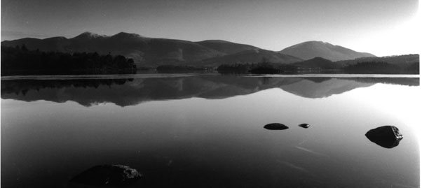
The strong light from the rght causes the print to appear unbalanced and draws your eye out of the image - a burn here would certainly help contain the image!
FIRST(!) attempt? You have to be kidding. This is great! Nice tranquil serenity. A joy to behold.
To me the image is stronger with less panoramic view, cropped just to the left of the right hand large stone, and about 10-15% off the left hand side as well. That's just my opinion, though. If you cropped it that way, you could use a slightly harder filter to increase the separation between the hills and the sky and finally burn in the bright area on the right some.
Thanks so much for your comments, unforyunately its not just my printing that needs work my scanning does to. The print is bright but not as burnt out as it appears on screen. Thanks for the input re the grade. I have been using a cold cathode head on an old devere 705 which is so blue mutligrade filters just don't work. Am now the proud owner of a 504 dichromat which i hope to use to sort the contrast issues.
Photrio.com contains affiliate links to products. We may receive a commission for purchases made through these links. To read our full affiliate disclosure statement please click Here.
PHOTRIO PARTNERS EQUALLY FUNDING OUR COMMUNITY:
This site uses cookies to help personalise content, tailor your experience and to keep you logged in if you register.
By continuing to use this site, you are consenting to our use of cookies.