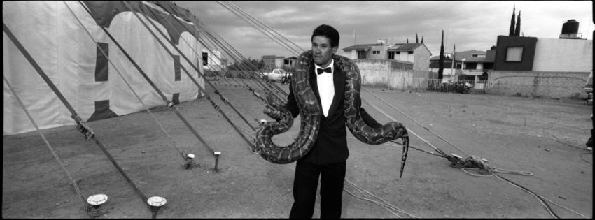
As I posted in the image of a clown pulling the truck, I'm thinking in putt together, for publising pourposes, my photos of clowns and circus performers. Last September I had a critic review of part of this work by a prestigous photo curator and she told me about this image that there is a lot of waisted space arround the main subject... I like it but... comments please.
While I would have liked to have the snake-guy separated more from the tent ropes (his right hand and the snake's head gets lost in the ropes) and the right edge is a bit busy (looks like a foot over there), I would disagree with the "prestigious photo curator" about the wasted space. I find that the space helps to define the main subject...it adds rather than distracts.
There is absolutely nothing wrong with it. I like the placement, angle, everything! I think that "prestigious photo curator" should rethink her career as she's full of mierda. The environment not only defines and supports the central character but creates the necessary ambiance and feeling for this almost surreal scene. I also really like the circular motion that the Top and the surrounding buildings create; with the slight tilt, it gives a hint of vertigo. The ropes tie the snake man well to the Circus and hold the horizontality of the frame. Excellent in all respects.
It's a very neat moment, but it seems a bit haphazardly posed. That, I think, is what the issue is with this image, not the lens choice or space (which works just fine, IMHO).
It's an interesting image and it'd be great to see other images from this series!
I agree with Vaughn about separating the man and snake from the ropes. No problem with space around him and the tent in the background as it sets the scene. I wonder if the curator was thinking of the town/city scene in the background. I found myself thinking: I wonder where this was? This distracted from the act and the circus which was counter productive.
I like it. Maybe crop the foot on the right as mentioned...
I think that the space works fine. I like the odd weight that the ropes give to this pano composition. There's a kind of skew to the clown pic as well, therefore, for me they work very well together.
The space is perfect, gives context, and his relaxed body language is great. I'd agree that the snakes head is lost a bit, but I'm not sure it bothers me... I certainly know how and where he spends his days.
I squint my eyes and see a balancing act. The dark areas in the houses with less area on their side of the figure weighing against the lighter dark areas on the tent make a good teeter totter. So...if panoramic formats lend themselves more to narrative types of images, your foto here creates a story with this man and his relation to his performance and the people he brings it to. Visual balance is not in vogue right now, but what's in vogue right now will be old hat next year. Thanks for the cool foto
Photrio.com contains affiliate links to products. We may receive a commission for purchases made through these links. To read our full affiliate disclosure statement please click Here.
PHOTRIO PARTNERS EQUALLY FUNDING OUR COMMUNITY:
This site uses cookies to help personalise content, tailor your experience and to keep you logged in if you register.
By continuing to use this site, you are consenting to our use of cookies.