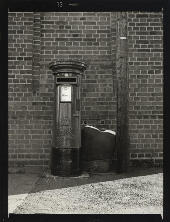
Your mailbox is not upright. It hangs to the right.
I find the light at the bottom distracting. The highest contrast lays at the bottom. Your main subject what I expect is the mailbox comes in second place.
I would have taken a different time so that the light did not make the mark at the bottom.
Next i find the overall not contrastly enough (to gray). I know why, because when you add a grade, the bottom sand will become white.
Photrio.com contains affiliate links to products. We may receive a commission for purchases made through these links. To read our full affiliate disclosure statement please click Here.
PHOTRIO PARTNERS EQUALLY FUNDING OUR COMMUNITY:
This site uses cookies to help personalise content, tailor your experience and to keep you logged in if you register.
By continuing to use this site, you are consenting to our use of cookies.