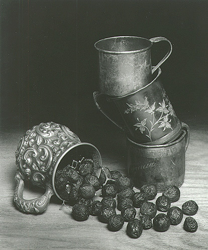
Cups and grapes
Flotsam

Cups and grapes

This is the arrangement that I prefer. I think that the stacked cups leaning in helps to balance and fill some of the empty space. Comments welcome.
Equipment Used
Omega view/Rodinstock 150mm
Exposure
16 sec f/22
Film & Developer
Efke R50/D76 1:1
Paper & Developer
Ilford MG RC
I agree with you. The cups are interesting because yes, they fill the space, and the lean gives you an almost visceral need to reach out and straighten them before they fall.

Those grapes look like raisins. You might want to turn down the hot lights! :smile:

-chuck
 
The key thing with still life is creating a sense of motion, and I think this does it, and the tonality is really beautiful (I'm guessing the black is purer in the print than in the scan--or if it isn't, try printing on fiber instead of MG RC). If you try to imitate classical still lifes like those of the Dutch Golden Age, you realize that they are usually impossible compositions, with objects that couldn't support themselves in the positions in with they are painted. There is always something about to fall off the table. They were also studies in color and texture, so doing it in B&W is that much more interesting.

I like it as is, but if you wanted to push it further and stay within the historical genre, I'd be interested to see what you would do with maybe one or two more textures in there--something really glossy like polished metal, and maybe something glass, or a liquid, or a woven fabric.
 
Agree with David, and FWIW, I would maybe try some different textures for the tabletop. You have these wonderful old looking pewter cups, which have so much character, but the wood tabletop looks very ordinary compared to the other elements. I would still keep it simple, maybe a light colored linen tablecloth or something, so as not to distract from the other elements.
 
Memento Mori, goes hand in hand with the joy of life...ah the still life...the empty cups...the kenetic energy of your composition...the withering grapes...where are you bacchus....ok I should shut up and go to bed...yes check into dutch still life....

I like this a lot...thanks...good job

Dave in Vegas
 
Thanks for the comments.
The negs could have used a tad more development but printed well with a #4 filter. The tone is much better even in the RC work print but it lost its strong Black when trying to match it on the monitor. I will print the final on fiber.
I bought a piece of 1/4 inch luan plywood and stained it walnut to create a "tabletop" but David and Suzanne make excellent suggestions for perhaps better alternatives. I like the linen, maybe even muslin tablecloth idea.
If I reshoot, what do you think about adding a touch diffusion? Just to "glow" the highlights a bit.

Dave,
I didn't consider it at the time but Memento Mori is probably an apt desciption. One of the cups is marked [18] '97. You have to assume that the infant that was given that Silver Baby Cup has moved on. Hopefully after a long and full life.
 

Media information

Category
Critique Gallery
Added by
Flotsam
Date added
View count
1,005
Comment count
11
Rating
0.00 star(s) 0 ratings

Image metadata

Filename
241cups1a.jpg
File size
73.9 KB
Dimensions
414px x 497px

Share this media

Photrio.com contains affiliate links to products. We may receive a commission for purchases made through these links.
To read our full affiliate disclosure statement please click Here.

PHOTRIO PARTNERS EQUALLY FUNDING OUR COMMUNITY:


Ilford ADOX Freestyle Photographic Stearman Press Weldon Color Lab Blue Moon Camera & Machine
Top Bottom