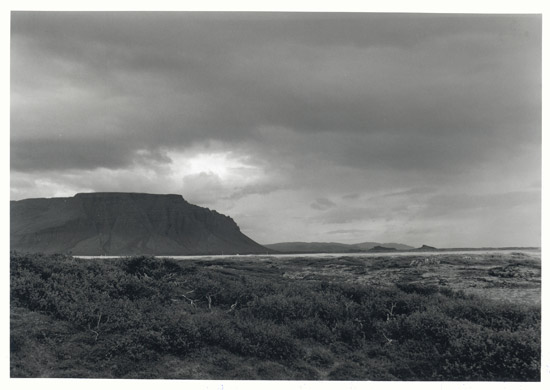
Rural scene
jonogmun

Rural scene

Please comment on composition and lighting.
Location
Western Iceland
Equipment Used
Mamiya 1000s, 80 mm lens
Exposure
n.r.
Film & Developer
Delta 100 in XTOL 1:1
Paper & Developer
Ilford MG
This one doesn't look level. It appears that the scene tilts left. This may be an illusion based on the white line (a road?) through the middle of the image, but it creates the impression nonetheless.

Regarding overall compostion. To my eyes there is nothing sufficiently interesting in the foreground to justify having it take up some much of the overall image. However, I see potential interest in various spots - there are some interesting, twisting white trunks (three, just left of center, low) that might form a basis of interest. Also, further away, under the mountain, just grazing the white line is a bush or tree or something that seems to have a lot of definition.

Perhaps either of these foreground subjects could have been incorporated by moving closer to them and framing a shot from there, making them more dominant.

Also, a filter could be used at the taking time to separate tonal values. At least, this one could use more contrast.

Another way this image could be made stronger, without reshooting, is by cropping off the right hand side, with the crop line running vertically right about at the foot of the foreground mountain, including all of the bright highlight area in the sky (including the "fingers" of highlight spilling right). That would also make those foreground elements described before more central and apparent. From there, perhaps further cropping of the bottom and top to make it tighter, may (or may not) make it even stronger.

My two cents, anyway... looks like a great place to be with a camera (and perhaps a coat!)

-chuck


-chuck
 
Actually, "cropping" it with my browser tells me that the vertical crop described above is probably too tight. Pull that vertical in far enough to make a square frame and it starts to get interesting. Somewhere between there and a traditional portrait ratio seems to make a good image. Tighter (as I described above) is too much I think.

-chuck
 

Media information

Category
Critique Gallery
Added by
jonogmun
Date added
View count
373
Comment count
2
Rating
0.00 star(s) 0 ratings

Image metadata

Filename
1857borgarfjordur.jpg
File size
40.2 KB
Dimensions
550px x 390px

Share this media

Photrio.com contains affiliate links to products. We may receive a commission for purchases made through these links.
To read our full affiliate disclosure statement please click Here.

PHOTRIO PARTNERS EQUALLY FUNDING OUR COMMUNITY:


Ilford ADOX Freestyle Photographic Stearman Press Weldon Color Lab Blue Moon Camera & Machine
Top Bottom