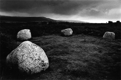
Interesting but it just fails slightly for me. There's a lovely Brandt like quality in the bold contrasts which really appeals to me and the composition is fine but it just looks a little too over processed for my liking. Still, this isn't a critique forum and its still a classy image. I'd be interested in hearing your thoughts?
It is fairly heavily manipulated. When i saw the negative, a Tim Rudman image from his printing book immediately sprung to mind - and thats the kind of print i have gone for. I'm not entirely happy with it, it took several go's to get the vignette right without losing all the detail around the rock on the left - it's still a little too black, but better than it was. The detail in the grass and fearns is clearer in the print.
I do rather like dark prints, i can't stand white hitting the print edges!
Great work, and not too dark. I think the fact you you have such a great composition, then focus the eye on the sweep of the stones is only enhanced by the mysterious printing.
Bill Smith - North Carolina
Photrio.com contains affiliate links to products. We may receive a commission for purchases made through these links. To read our full affiliate disclosure statement please click Here.
PHOTRIO PARTNERS EQUALLY FUNDING OUR COMMUNITY:
This site uses cookies to help personalise content, tailor your experience and to keep you logged in if you register.
By continuing to use this site, you are consenting to our use of cookies.