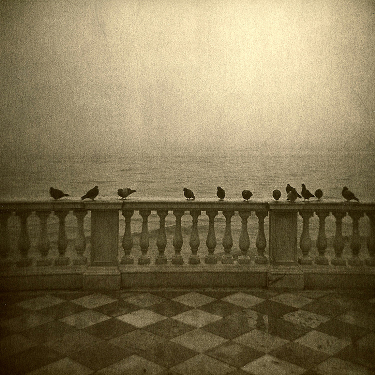
I much prefer this one. The other version is too light. This one has nice chunky grain. Also because the sky is darker it has more feeling of depth. The sky in the other print seems universally light, whereas the dark edges in this sky make the central lighter area stand out by contrast. So this sky ends up feeling brighter, while in fact being a bit darker.
Overall this one feels gutsy & the other feels a bit anemic.
Also I observe the other print is cropped at the sides while this one has a bit more space at the edges, which I like as it gives me more context for the subject.
Lovely photo too, keep it up.
I think this one has better mood and suits the matter of 'waiting' better. (I imagine the pigeons are 'waiting' for something good to come along).
Truly stunning. You are one of the lith meisters here for sure.
- Thomas
Photrio.com contains affiliate links to products. We may receive a commission for purchases made through these links. To read our full affiliate disclosure statement please click Here.
PHOTRIO PARTNERS EQUALLY FUNDING OUR COMMUNITY:
This site uses cookies to help personalise content, tailor your experience and to keep you logged in if you register.
By continuing to use this site, you are consenting to our use of cookies.