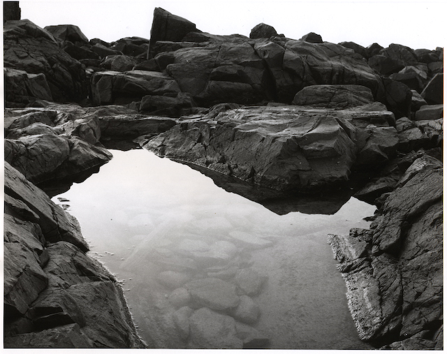
The variations you talk about might 'improve'; certainly, they would give a different image. As it is, it's fantastic, and I'd be happy to have done it myself. It reminds me of an (I think) Edward Weston print I was looking at in the last issue of B&W Magazine.
Aaron, I agree with Rob that this does stand on it's own. If you wanted to improve it, an edge burn at the top would bring the eye back down and provide a frame to balance to the print. Also a crop on the LHS might be useful as well as that rock jutting out takes your eye, especially with no edge burn. If you crop the LHS to remove the top rock, it balances out more. That coupled with an edge burn could bring the full potential out. I also notice that you have cropped this from square format to rectangle. What did you leave out that could provide other composition options? Just my .02 and IMHO. It does work like this, but I agree it needs a little bit extra.
Thanks Andrew, as always, you're a great help The top was cropped off the original. That rock in the upper left lead out to another another rock outcropping that stretches the width of the frame. I wanted the shot to be primarily about the little tidal pool. The extra outcropping seemed to take away from that but, now that you mention it, if I crop it right, would serve as a nice border along the top. I'll revisit this one next time and see what I can come up with.
For me, there is a problem of balance. I find myself cropping the image on the screen back to a square by cropping both sides right up to the pool and removing a little of the sky. All of a sudden, the rocks on the horizon become stronger elements and the pool dominates.
But then I do have a positive bias towards the square!
I would crop out the sky portion at the top of the picture and leave those rocks dark as they are. Then the real work begins, working on the contrast of the surrounding rocks to the pool.A harder grade filter to print the rocks and a softer grade filter for the pool. Check out split grade printing. Experimenting is one of the joys of photography.
I like the mood of the picture but cropping may strengthen. Try cropping off about 3/8" (as seen on my monitor) on the right side and 3/8" on the bottom. Effect is to emphasize the pool more and to balance.
Thank you very much everyone for the input. So is the consensus that the shot is at least worth working with? Normally I'm pretty "black or white" on whether I like a shot or not but, this one I'm uncertain on.
Photrio.com contains affiliate links to products. We may receive a commission for purchases made through these links. To read our full affiliate disclosure statement please click Here.
PHOTRIO PARTNERS EQUALLY FUNDING OUR COMMUNITY:
This site uses cookies to help personalise content, tailor your experience and to keep you logged in if you register.
By continuing to use this site, you are consenting to our use of cookies.