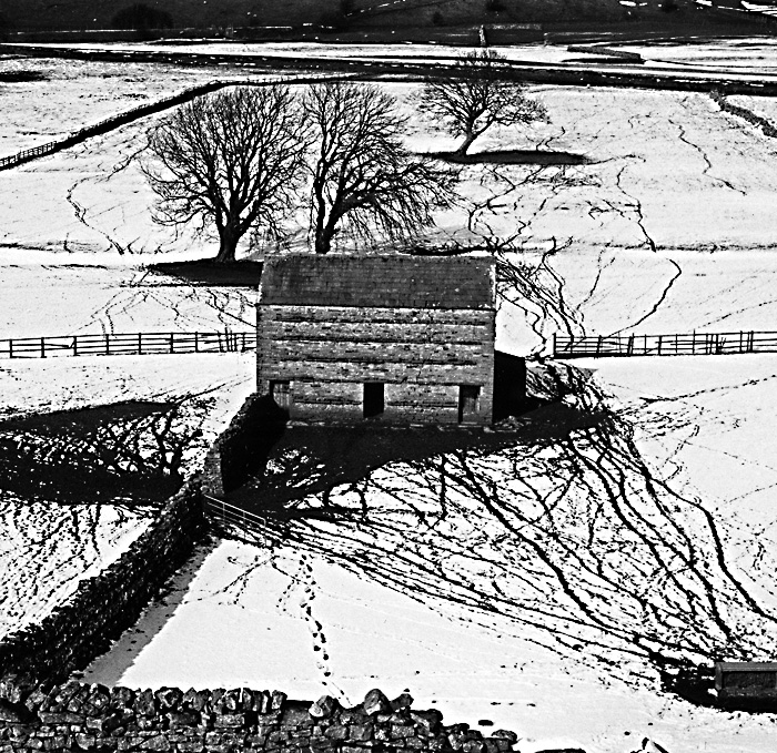
Taken with a 35mm SLR but cropped square as I feel there was too much clutter around the edges. Does this composition work for anyone, or do there various angles compete or work against each other?
Apologies folks - far too much sharpening (unsharp masking) on both of these two images. One day I'll get the hang of this Photoshop malarky. Until then you'll have to bare with me.
Don't wast your time with PS, there's enough here to work with.
I think the composition should work well for a high contrast print. Yes, there is conflict, but that's not always a bad thing to have in a picture.
I would bare with you but I am not that way inclined. Ha Ha.Seriously it looks good. A lower contrast might be better for the whole scene but you'd lose the stark snow free lines in the fields and this is a big enough aspect of the picture to make the high contrast win the day on balance.
I know so little about PS that you'd have to bear with me a lot more if I tried anything with PS.
I argree with the high contrast but I think the upper 1/3 should be removed and concentrating on the buildings and the paths in the snow. the upper part is too dark and make the upper part of the print too heavy.
just my thoughts
I think there is far too much posterization. How about posting a straight neg scan, no PS, and then we can advise. The composition may be fine but the issues with the tone scale make it hard to judge whether the print can succeed.
Thanks for all the comments. The issue with shapening and the use of levels in PS is probably a key one for me at the moment. My paper scanner (I don't have a neg scanner optiopn) is of the cheap and cheerful kind and none of my scanned prints comes anywhere near what they look like on paper, certainly with regard to crispness - they all end up with a slightly fuzzy quality even though detail is pretty sharp on the actual prints. The line of people in the above image is a good example - they look much cleaner with better edge definition on the print than they do above.
I had read somewhere (always a dangerous thing!) that using unsharp masking in PS can help before sending an image for print or upload to the web. So, I've started to tinker a little with this after resizeing and, while they (and certainly this image) looked tighter in the little preview pane, when uploaded they actually looked far worse - slightly blocky and not crisp at all. Levels is another issue I have difficulty with. It doesn't seem to matter what I do every image I've uploaded looks darker and more contrasty then in the image on paper. The image I posted of The Lowry Centre is a good example - lovely broad range of tones in the print - slightly heavy and lacking that full midrange that I get with Fuji Acros on the screen. Guess I probably need to upgrade my scanner and get a better correlation on my screen.
By the way Pentaxuser thanks for pointing out my classic senior moment - doesn't bear thinking about really.
I'll look to post a simpler version of this when my learning improves...
I don't know if this will be any help to you, but I always just sharpen lightly at 8 60 0 (amount, radius, threshold). I do it before and after I downsize the photo.
I like the contrast in the picture. I might try cropping out the thin band of "dark" at the top.
Photrio.com contains affiliate links to products. We may receive a commission for purchases made through these links. To read our full affiliate disclosure statement please click Here.
PHOTRIO PARTNERS EQUALLY FUNDING OUR COMMUNITY:
This site uses cookies to help personalise content, tailor your experience and to keep you logged in if you register.
By continuing to use this site, you are consenting to our use of cookies.