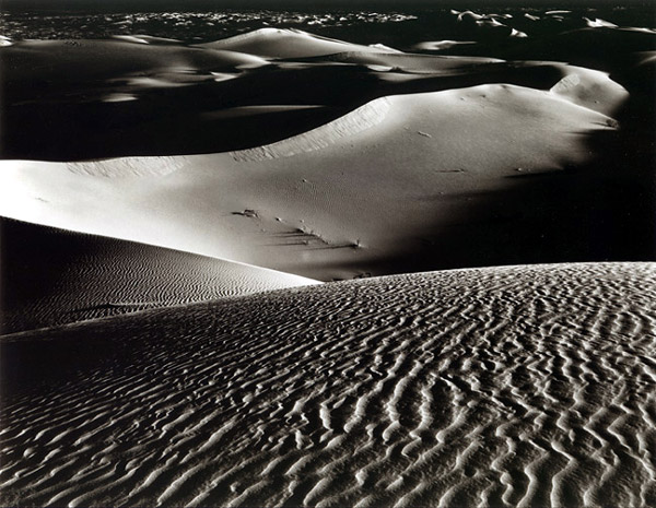
Personally a bit dark and contrasty for me, but I'm sure perfect for other! Reminds me on a lunar scape with those spacey blacks...cant spot the rover tho....
Great layering, forcing he eye to have good wals about. Howzabout posting a G2 Azo print for comparison?
Tom
Sorry, but this qualifies as "over the top." I've spent many dawns on dunes praying for 4 stops of contrast. When I see 10 stops, it's disorienting. Ansel Adams called this the charcoal and chalk syndrome.
I want to love this image, as it has all the elements of a great one. I think it would be wonderful with 30 shades of gray, not 2.
I'd be willing to bet the print shows much better tonality than the scan with respect to shadow and highlight detail. With this amount of contrast, the foreground itself would make an interesting abstract. It almost looks like ripples of foam at the beach.
Photrio.com contains affiliate links to products. We may receive a commission for purchases made through these links. To read our full affiliate disclosure statement please click Here.
PHOTRIO PARTNERS EQUALLY FUNDING OUR COMMUNITY:
This site uses cookies to help personalise content, tailor your experience and to keep you logged in if you register.
By continuing to use this site, you are consenting to our use of cookies.