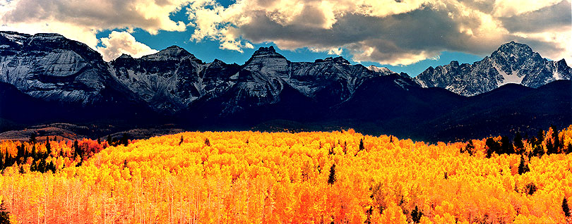
This photograph was taken in midday under extreme lighting conditions without any filters. In the original print there is full detail in the extreme highlights of the clouds as well as in the deep shadows of the mountains. Unfortunately, my scanner was unable to record that information.
As is true for many, my work doesn't allow me to witness scenes like this in person, but this sure whets my appetite to do so when I retire someday. Thanks for posting.
David, yes I am using a highly modified method of contrast mask to get what is on film on to a high contrast paper. I alter the development times of my film to control contrast just like you do in b&w and to extend the dynamic range of the film I use. Note that my normal develop time is not 3:15, but rather 2:45. I also use something I call CIMs which stands for (c)olor (i)ntensification (m)asks and is a proprietary method that has taken years to develop. It allows me to control color hue, saturation, and brilliance at the local or global level of the print.
There are three areas that allow the photographer to control the visual drama of the image. They are compositional methods, film exposure/development methods, and darkroom printing methods. The latter I am reluctant to discuss at this time, but I am considering making everything I do public which why I am even having this conversation.
I try to create compositions with extreme values and complementary colors. By placing these opposites adjacent to one another you can create illusions of brilliance. In the above photograph there is knife edge between the sun drenched aspens and the forbidden dark mountains. The aspens and mountains lie at opposite ends of the gray scale and create an illusion of gray scale brilliance. In the photograph I posted called Indian Paint Brush I have tried to place complementary colors red and green adjacent to one another to create an illusion of color brilliance. So not everything you see occurs in the darkroom, but rather starts in one's mind on how he organizes the light and colors in the composition.
For film processing, I model my film just as Ansel Adams does with the Zone system. What follows are my break downs of development times:
For Portra 160 VC exposed at ISO 80
N+1.....3:15...9-10 stop dynamic range.....Normal development for the industry
N.........2:45...12 stop dynamic range........Normal development for Stephen Willard
N-1......2:30...13 stop dynamic range
N-2......2:15...14+ stop dynamic range......Any reds in Zone III or less will turn muddy brown.
Note these times are based on the old Portra film. I have done some testing with the new Portra film and found that its a faster film with much finer grain. I am using these times at ISO 100 for the newer film, but they may change as I do more testing.
For making mask to control contrast, all I can say is that my mask do NOT look anything like unsharp mask for b&w which are supposed to very faint positive images of the negative. My masks are as thick as bricks because of the extreme values in my negatives and the extreme characteristic curve of the paper I use. The materials are not very compatible. In fact, my mask are so thick they will severely flatten all elements that share similar values (such as trees and bushes in a shaded area) to an unacceptable level. So the question is how do you produce a mask that bridges extreme values to preserve subtle detail in say Zone III and Zone XIV and not compress elements of the composition that share similar values. The solution to this is so simple it is ridiculous, but at this point I am not willing to share. I can say this, it did take me a long time to uncover this very simple solution.
The CIMs I noted above is where the real power lies. If you could see what I can do with them it would blow you away. I know it does it to me, and I am guy who figured out how to make them. What ever you can do in Photoshop, I can do better or equal except I cannot deviate from the optical reality of the original scene. I have spent the last six weeks carefully testing and quantifying CIMs so that I can be more effective at applying them in a creative manner which is really what this whole thing is about. For example, the reds in the indian paint brush of the photograph "Indian Paint Brush" have been elevated in value and saturation from Zone III to a Zone V value to bring focus to the composition and its title. The three images I have just posted are a result of my testing efforts for the past 6 weeks. On average the number of layers of film and other materials I use in my negative drawer is around 5, but it can be as little as 4 and has been as much as 10 layers. I believe "Indian Paint Brush" used 9 layers in the negative composite.
Having said all of this, I believe many viewers will think my images have been heavily Photoshoped, but the truth is, they have not.
Hi Eddie, as I said I am not willing to share my toys in the sandbox, yet. However, one of the reasons I am considering sharing what I do is motivated by what you just said. I am concerned about the viability of film and APUX users longevity. If film goes away then I am in trouble. Whether Stephen Willard's famous recipes (that is me) will save film or not is perhaps a little foolish, egotistical, and far fetched, but there may be some merit to it. That is something I have to decide.
Here is something that you can do in the interim that will cover 80% of your shooting. I highly recommend that you get the book " Way Beyond Monochrome". Of course, it is about b&w, but I have borrowed heavily from it extrapolating many of the methods outline in it pages to color photography. There is an excellent section about unsharp mask. I use their method as a predictor to determine mask exposure times and development times to achieve the density range of the mask that will give me an overall film composite density range of around 0.38 density units for my system. A negative composite or a negative by itself with a density range of 0.38 prints very nicely on Fuji papers for me. Keep in mind the greater the scene dynamic range is the greater your negative density range will be and the thicker the mask has to be to reduce the composite to 0.38 density units.
I use TMX 100 developed in HC110 diluted 1:7 for two development times of 5:00 and 8:00. Of course there is a lot of other issues you will have to work out.
Because TMX 100 is daylight balanced then you need to expose it at that temperature which means you have to compensate for the orange mask of color negative film. I actually bought an expensive color meter to adjust my colorhead with plain unexposed developed color negative film in it to achieve a daylight balance of 5000 degrees. The settings were 00Y 05M 75C. Whether this will give you a precise temperature reading in your colorhead I do not know, but I think it will be close enough.
If you keep the dynamic range of your scene down to 8 stops or less then you will not have to use brick thick contrast reduction masks. You can use the thinner CRMs with Fuji Crystal Archive Super Type C papers without suffering from severe compression of elements having similar tonal values. However, once your scene approaches 9 stops or higher then you will need to resort to the nuclear bomb CRM which has lots of problems with it besides what I have mentioned above.
You could also resort to doing dodging and burning as well like AA did all of his life. I have decided to put my expertise and efforts into CRMs and CIMs so that it becomes a simple matter of a single exposure to produce a new print forever after. CRMs are much more precise and can handle compositions that are highly fragmented and would be impossible to dodge and burn. You can also simulate CIMs this way by changing the color settings of your colorhead as you burn in different areas of the print (and that is a big hint of how I do CIMs).
Hi Svend, thanks for your input. Frankly I am disappointed, not with you, but with the photograph. It falls far short of what I witnessed that day. There is no way I can articulate why in words, but if I could somehow take you there (which I would love to do) then you would know exactly what I was talking about. You call it pumped up, but I say it severely understates what actually occurred that day.
I find all modern day digital sensor and films fall far short of recording what I experience in the wild remote areas of the western landscape. It has been a continuous source of frustration for me and has taken me on a journey of innovation and invention trying to find solutions that can proved reasonable approximations of the things I have seen and experienced. I suspect that I will never get there. Mother nature is far to wild and variant to be staged and tamed by an insignificant photographer and his tiny camera, and that is why I find her so intoxicating.
I am not sure if I follow or agree with your logic about over done pumped up exhibits. I was just at Thomas Mangelson's gallery at the Denver International Airport who shoots with slide film and prints on Cibrachrome. The contrast of his images are about twice that of mine, but overall mine seemed to exhibit more brilliance then his. His gallery was arranged like a maze. Each time you turned the corner there was yet another surprise. It was a lot of fun for myself and the many people who were there. I did not experience the fall off in interest nor did the people who were there. I suspect that if the photographs were lined up on one continuous linear wall then the effect you have noted would be realized. By breaking up the visual experience into a maze then it becomes a visual treasure hunt of what would come next. I had to walk through it 3 to 4 times to absorb everything that was there. The subjects were varied. The shapes and sizes of the images were varied. There were books, music, cards, puzzles, and of course pumped up images everywhere. It was a joy to visit.
Oh Svend, to me a photograph is a painting and not one once less. I contend it takes me longer to produce a photograph then a painter to paint a painting. It can take me years of revisiting a composition over and over again until I get the right light. In the darkroom each photograph is subject to many different renderings, stuck on a bulletin board and stared at for weeks if not months, I write about the experience of the photograph because it is not fictional but rather experiential, and then I subject the photograph to criticism from family and friends. Only then do I make a final decision on the final rendering. I doubt if to many painters put the effort and time I do in constructing a photograph. I also encourage other photographers to model their work not as snap shots, but rather living works of art because that is exactly what is. Each photograph is a true story of what you saw and FELT during a living moment in time.
Very interesting work. One of the difficulties of color work is that everyone sees and experiences color differently. You also seem to see (or feel) a higher contrast level than the average person...or at least me.
The color relationship between the intense yellow and the "exhausted Blix" blue (on my screen, anyway) of the mountains is strong. The lack of "atmospheric distance" (lighter, less saturated colors as the distance increases) makes the scene seem compressed, yet the clouds seem to come forward a bit...if creates some interesting tension in the image for me.
Would I like to have this image on my wall? Not really...like Svend mentioned, my eyes would quickly tire of such color intensity and contrast in a landscape. But that is just a personal thing...there are tons of people who find my B&W images a bit boring. For some odd reason your photographs remind me of the work of Tom Killion, a woodcut artist, tho his colors are not as intense.
Keep up the exploration! Neat stuff! Vaughn
PS...a late thought here. I was trying to figure out why this image does not "work" for me...beyond the personal aspect of the color and contrast. One reason might be is that in all your hard creative work with the image, you might have treated the three parts of the images (foreground of gold, the mountains and the sky) as separate entities and, for me, they no longer work together as a whole image. Instead of being the fusion of all the elements, which is what a landscape can be, it seems to me to be an image of the intense yellow of the trees and the blue ruggedness of the mountains and the Presence of the clouds.
I recently watched a YouTube flick about color adjustments in PhotoShop...because I only know enough about it too get myself in trouble. One thing the woman mentioned is that one should try to apply changes in only small amounts -- too great of a change in any one or more colors, then one runs the risk of disrupting the inherent color balence of a scene. For example a portion of the image may become warmer than an bordering area, but without an appearent reason for it (such as one area being in open shade and the other in sunlight.)
Remembering this brought several things together. You said you change filtration (or equivilent) when using the different masks. Thus you are changing the color balance locally within the over-all image. Perhaps this is what gives me the feeling that something is not "right" with the color in your images.
This in no way infers that the color in your images is wrong. It is just the impression I get by looking at the images...and relates to the connection I made with Tom Killion's woodcut prints. The colors of your images look chosen, just like an artist chooses which color to apply to the woodcut. It is kinda neat.
Photrio.com contains affiliate links to products. We may receive a commission for purchases made through these links. To read our full affiliate disclosure statement please click Here.
PHOTRIO PARTNERS EQUALLY FUNDING OUR COMMUNITY:
This site uses cookies to help personalise content, tailor your experience and to keep you logged in if you register.
By continuing to use this site, you are consenting to our use of cookies.