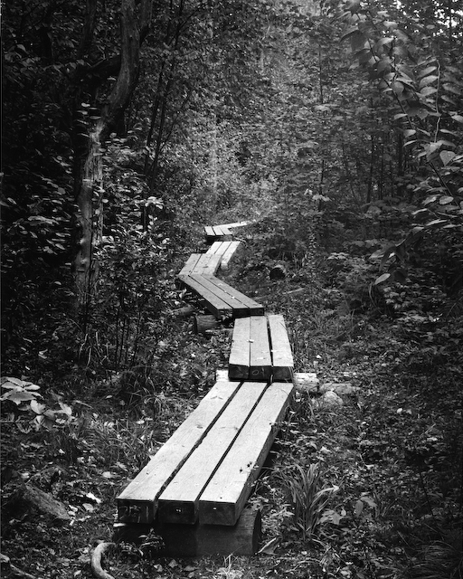
Thanks Gene and Bertus This was one of my first film shots before I had any understanding of filter use, so the trees and plants along the sides fall pretty flat contrast wise. It just seems like it needs something. I dunno, maybe I've just been staring at it too long and over thinking it??
I think that it looks great as it is. If I was to do anything, I would play with the g3 paper some more, perhaps practice some more burning around the top and right hand side. Make the path itself stand out, as it, no doubt, is the focus of attention. The silvery sheen from the wood plans is really nice, make it stand out more.
- Thomas
It looks good as it is. The only selective thing to consider would be a VERY SLIGHT burn in on the first section (which is a wee tad bright). If that is a function of the video screen, then I withdraw the correction. I would try to just dull it down a wee bit without impacting the overall luminosity of the photo. Very nice composition and print. Thanks for posting.
Thanks David and MP MP, it is not just your screen. The above shot is pretty much spot on to the print. You can see all the wood grains in the print though that don't quite come through in this small of resolution. I tried playing around with it a bit and just couldn't quite seem to get it right. That was one of the major things bugging me with this print. Guess I'll just have to play with it some more. Think I'll need to burn in that upper right a bit more as well and that should about get it to where I want it.
I agree, it's very close to something I'd like to hang up on my wall. I think the problem isn't with your vision, it's with the way that film records all the lovely shades of green our eyes see. You saw the photo in mind's eye one way, and then the foliage darkened on film.
Can you shoot it again this summer? It's a nice place, I'd like to see it using infrared film with a red filter. In medium format that would look sweet! Maybe a little lower vantage point, and with a shaft of light penetrating the canopy. That's the kind of shot I'd pay money for and I'm stingy.
I suggest the lower vantage point, only because thats the way I see things, from a wheelchair view, so it looks more natural for me.
One other thought would be to try split grade printing (print at full grade 0 and then print at full grade 5). This results in a built-up image with a hybrid print grade (as determined by the amount of time in each extreme grade). It seems counter-intuitive, but it can be a very effective technique on some negatives. In that way, you could get the wood highlight just the way you want.
I suspect there are good threads on APUG about this technique. That works sometimes on areas that may be difficult to burn in (without getting spill over).
Photrio.com contains affiliate links to products. We may receive a commission for purchases made through these links. To read our full affiliate disclosure statement please click Here.
PHOTRIO PARTNERS EQUALLY FUNDING OUR COMMUNITY:
This site uses cookies to help personalise content, tailor your experience and to keep you logged in if you register.
By continuing to use this site, you are consenting to our use of cookies.