-
Welcome to Photrio!Registration is completely free and logged-in members see fewer ads.Click here to sign up
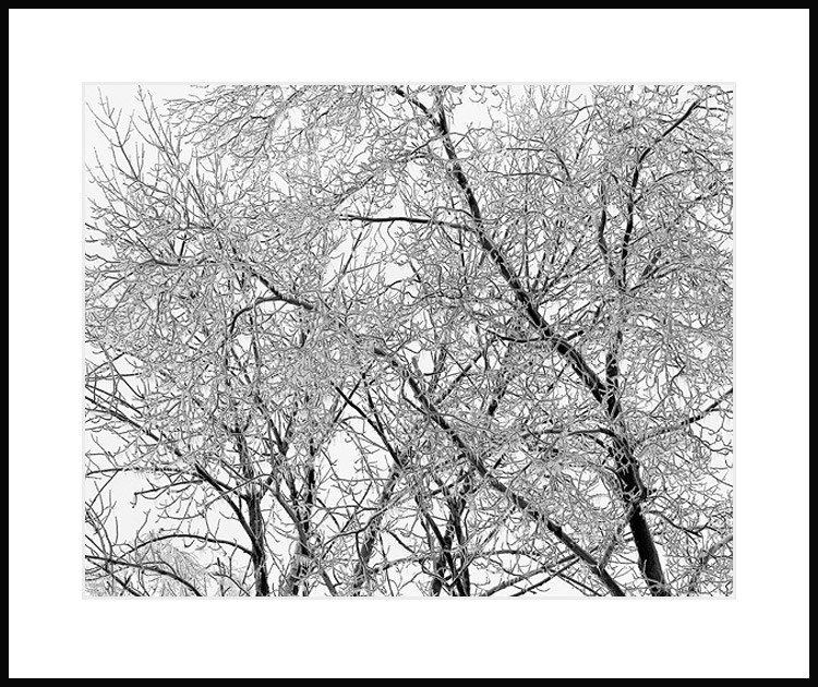


Icy Trees Behind Our House
-
A
- jovo
- Location
- Behind our house
- Equipment Used
- Shen Hao 4x5, 250mm
- Exposure
- 1/4" @ f22
- Film & Developer
- Ilford Delta 100 in D76 1:1
- Paper & Developer
- neg scan to resemble print on MGIVFB
| Photrio.com contains affiliate links to products. We may receive a commission for purchases made through these links. To read our full affiliate disclosure statement please click Here. |
PHOTRIO PARTNERS EQUALLY FUNDING OUR COMMUNITY:  |