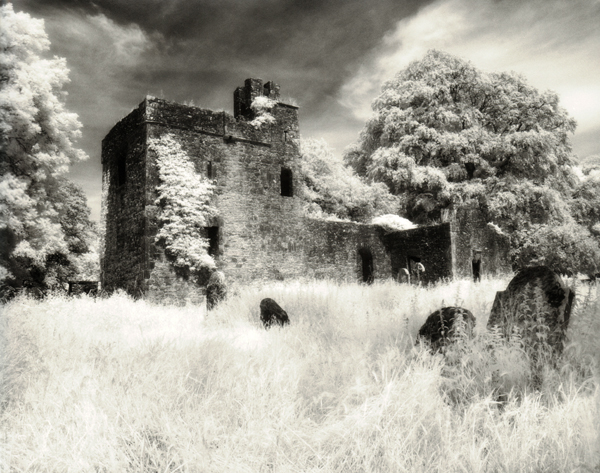


St. Oliver Plunkett's Church
-
A
- thefizz
- Location
- Loughcrew, Ireland.
- Equipment Used
- RZ67 & 50mm lens
- Exposure
- 2 seconds at f22
- Film & Developer
- Maco IR 820C Aura
- Paper & Developer
- Ilford MG IV Fibre
- Lens Filter
- Heliopen 715
| Photrio.com contains affiliate links to products. We may receive a commission for purchases made through these links. To read our full affiliate disclosure statement please click Here. |
PHOTRIO PARTNERS EQUALLY FUNDING OUR COMMUNITY:  |