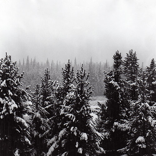
This was a shot that I took last Ocotober at Winter Park. The snow storm was just getting started and visiblity kept getting less and less as time went on. One of those peacefull snows when all you can hear is the snow falling.
The placement of gray values between the background spruces and foreground spruces is just right. However, this looks more like something one would do for a cover magazine because of all that vacant white space above the trees. It is a great place to stuff text, but has nothing to add to the composition of a fine art print. Do not ever do that again.
Sorry Derek about being so harsh. I may be posting some of my work shortly and you will have a chance to get even.
I agree. It appears to be something to which I would add something. This is a fine experiment in photographing a winter scene to see if you can keep the detail in the shadows...(but you're too dark for that). I'd say tighten up and lighten up. AND KEEP SHOOTING.
Photrio.com contains affiliate links to products. We may receive a commission for purchases made through these links. To read our full affiliate disclosure statement please click Here.
PHOTRIO PARTNERS EQUALLY FUNDING OUR COMMUNITY:
This site uses cookies to help personalise content, tailor your experience and to keep you logged in if you register.
By continuing to use this site, you are consenting to our use of cookies.