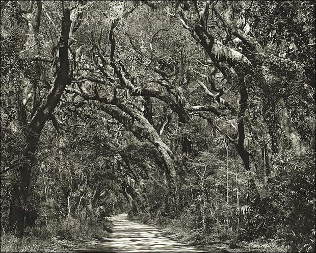
On the drive to the Kingsley Plantation, I pulled the car over just here and made this image. As a Yankee, the lushness of this little dirt road scene was too unusual to pass by unrecorded.
Thanks Chuck. The deliberation was exactly which of the many shaded areas to regard as Zone III. In the print there is detail in just about everything...the scan doesn't resolve the detail in the darker areas very well at all.
Funny that I was down that road last week but didn't recognize what you saw - very well done. Especially like the tone of the print - a warm-tone developer?
Thank you Doug. I've printed this two ways: on warmtone and 'regular' paper. This is a scan of the MGIV paper that I fussed with to try to duplicate the tone of the warmtone version that I made on 11x14 paper and couldn't scan (I'm somewhat red-green colorblind and matching color is a major challenge for me). I like the warmer version better. My wife had a few sheets of this material in a matte surface left over from some work she had done and I thought it would work well here for its' tonality despite the fact that I don't care for matte surfaces at all.
I like this image. It is a pleasing composition. I have some questions and suggestions regarding itl, however. While the overall contrast grade appears to be accurate, the local contrast seems to be lacking.
I wonder if you have totally lost shadow detail in the dark trunks. If you haven't then I think that I would try to print this slightly different to gain greater local contrast especially in the region of the tree foliage. I am wondering if greater separation could not be obtained in the Zone IV - VI regions of this print. In order to do that then I would either preflash the paper to compress the highlights downward and print at a higher contrast grade. Or I would unsharp mask and compress the shadows upwards and print at a higher contrast grade.
Thank you Susanne and Mark. Donald, your printing suggestions are well worth trying. It's fun posting in the 'critique' section because I'd not have thought to preflash here and it seems like a great idea. I've never made a contrast, or unsharp mask before; those are the two manipulations I've yet to learn to become a better printer.
I agree with some of the other comments. The road is what really makes the photograph because it leads my eye where you want it to go - down through this scene with all of the trees bending over and forming a tunnel. I think - well done. Thanks.
I've come back to look at this a couple of times, John. While I think I might agree with Donald's local-contrast comment, I also suspect this is a case where the scale of the scan may not do the original justice. This is an image that needs to be printed big to appreciate the detail.
As an aside, you may have a couple of interpretations here. I've had dreams about a road like this (nightmares, actually) where the scene was moon-lit and the trees were alive (and trying to get me). Cold-blue toning, and a lower key would make a surreal version of the same image.
Photrio.com contains affiliate links to products. We may receive a commission for purchases made through these links. To read our full affiliate disclosure statement please click Here.
PHOTRIO PARTNERS EQUALLY FUNDING OUR COMMUNITY:
This site uses cookies to help personalise content, tailor your experience and to keep you logged in if you register.
By continuing to use this site, you are consenting to our use of cookies.