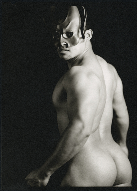


The Devil - version 2
- Equipment Used
- Century Master 5x7, Seneca wp Portrait lens
- Exposure
- unrecorded
- Film & Developer
- Fomapan 200, Pyrocat HD 1:1:100
- Paper & Developer
- Bergger COT320, Platinum/palladium, PotOx
- Lens Filter
- n/a
| Photrio.com contains affiliate links to products. We may receive a commission for purchases made through these links. To read our full affiliate disclosure statement please click Here. |
PHOTRIO PARTNERS EQUALLY FUNDING OUR COMMUNITY:  |