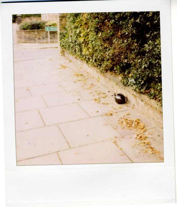
I thought this was a pretty decent composition until someone I showed it to said it looked too plain. I thought the extra negative space gave it more context.
I really like this type of stuff, so I don't know how objective I can be. I wonder if you could do a little post processing to boots some of the color? Either way, like I said, I like this type of stuff and this image. - Sean
I really like this one too, the negative space works well. Polaroid is a very underused medium these days and this is a fine example of the way they should be used. The only thing I can criticise is the slightly askew scanning.
Tony
Photrio.com contains affiliate links to products. We may receive a commission for purchases made through these links. To read our full affiliate disclosure statement please click Here.
PHOTRIO PARTNERS EQUALLY FUNDING OUR COMMUNITY:
This site uses cookies to help personalise content, tailor your experience and to keep you logged in if you register.
By continuing to use this site, you are consenting to our use of cookies.