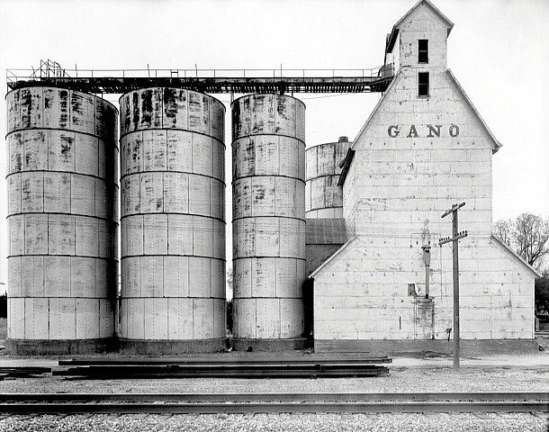


Homage to Wright Morris
- Location
- Western Kansas
- Equipment Used
- 8x10 Deardorff, 12 inch Commercial Ektar lens
- Exposure
- f/32, 1/25 second
- Film & Developer
- J&C Classic 400, Pyrocat HD 2:2:100
- Paper & Developer
- Kodak Azo Grade 3, Agfa Neutol WA
- Lens Filter
- none
| Photrio.com contains affiliate links to products. We may receive a commission for purchases made through these links. To read our full affiliate disclosure statement please click Here. |
PHOTRIO PARTNERS EQUALLY FUNDING OUR COMMUNITY:  |