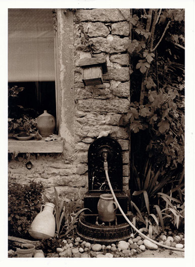
I had to look at this for quite a while before seeing all the detail in the foliage, so I'd agree that the toning is right. Anyway, the harder a viewer has to work at a picture, the more they're going to get from it. I like this one... thanks for posting it.
I, too, like the interplay of lines, angles and shapes, along with the toning. The image seems just a little dark and/or lacking in contrast, however, causing some of the detail to be lost or subdued. Printing "up" or increasing the contrast a touch might change the mood of the image, however. So, it really depends, I think, on what you were going for.
I'd also suggest that there are perhaps even more compelling compositions within this scene that could have been captured by getting in closer, and perhaps with a lower camera position. A closer shot of the stepped cast-iron faucet fixture, jar and hose, for example, would have been interesting, as the faucet fixture appears to have very interesting detail.
Thank you all for your comments.
Ralph, I tried your suggestion of cropping tighter around the faucet (in Photoshop) and I agree, it appears to be an interesting image. I'll try this out in my darkroom and see how it turns out.
Photrio.com contains affiliate links to products. We may receive a commission for purchases made through these links. To read our full affiliate disclosure statement please click Here.
PHOTRIO PARTNERS EQUALLY FUNDING OUR COMMUNITY:
This site uses cookies to help personalise content, tailor your experience and to keep you logged in if you register.
By continuing to use this site, you are consenting to our use of cookies.