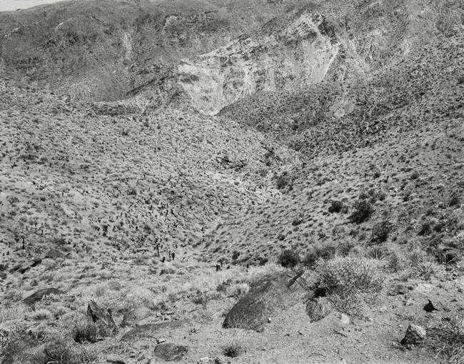
There is a little dance that has to be done when printing on the last batch of F2 Azo to keep it bright without going weak or dull. I wish I could print on a higher grade of paper, but the negative is far too contrasty to print on grade 3. I tried exposure/developer ratios to bring out a little more serparation, but any less exposure/more development of grade 2 will dull down the highlights (which seems counter intuitive) while turning it too blue. I did dodge the rockslide to bring out a little more separation, but more dodging made it weak in the lower end. The print seems right on. I think we blame the scan way too often for terrible reproductions. I think the problem might just be in all our monitors.
Photrio.com contains affiliate links to products. We may receive a commission for purchases made through these links. To read our full affiliate disclosure statement please click Here.
PHOTRIO PARTNERS EQUALLY FUNDING OUR COMMUNITY:
This site uses cookies to help personalise content, tailor your experience and to keep you logged in if you register.
By continuing to use this site, you are consenting to our use of cookies.