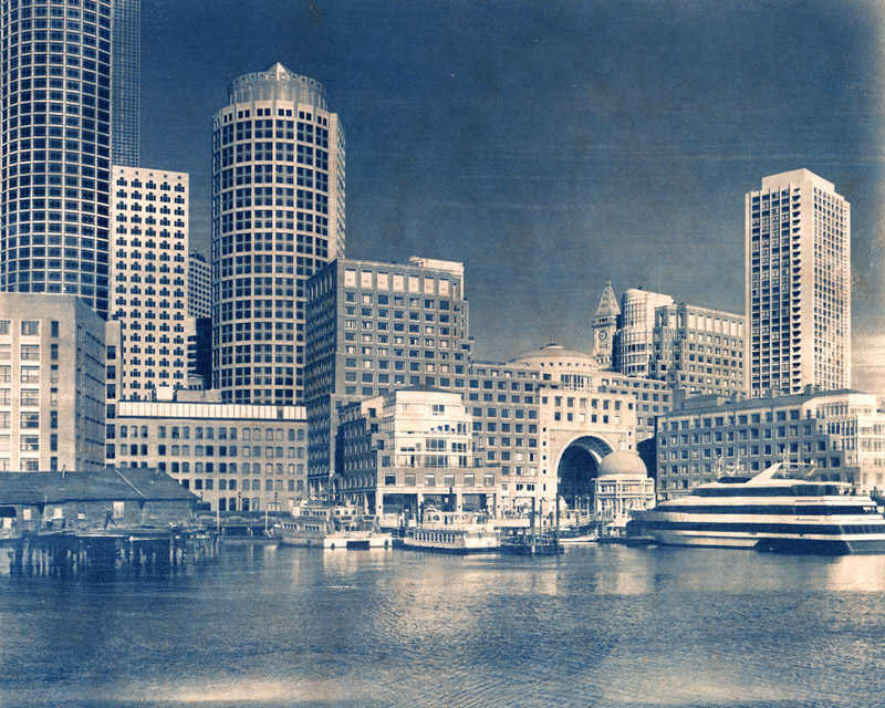
I absolutely love the look of this - it would be beautiful to look at in person, I'm sure. I think it's a very good choice of subject and process. Thank you for sharing!
There's a very engaging bit of tension (potential animation) where the strong horizontals meet in front of (what looks like) a cruise ship. The arch seems ready to receive the small domed building with just a little nudge from the ship. Also, the ancient looking wharf on the lhs and the cruise ship form nicely symmetrical pointers into the body of the beautifully toned composition. Well done!
These cyanotypes look incredibly interesting to me. The relationship between new and old is almost surreal with the big modern yacht to the right in contrast to the old building to the left, as well as the stone building with the arch.
The tone with the black tea really helps the blue color along. Wonderful photograph all together.
Since it's in the technical gallery, what does tea toning do for permanence? Good, bad, neutral? I'm curious.
Thanks for the really nice comments, they're much appreciated!
Thomas, if anything I think the tea toning will help prevent fading. That's because ferric ferrocyanide (the blue pigment) tends to fade in alkaline environments but is maintained in acidic environments, Tea is quite acidic. Of course the other side of the coin is how well the parchment holds up to the acidic environment, and I have no idea about that one.
Photrio.com contains affiliate links to products. We may receive a commission for purchases made through these links. To read our full affiliate disclosure statement please click Here.
PHOTRIO PARTNERS EQUALLY FUNDING OUR COMMUNITY:
This site uses cookies to help personalise content, tailor your experience and to keep you logged in if you register.
By continuing to use this site, you are consenting to our use of cookies.