-
Welcome to Photrio!Registration is completely free and logged-in members see fewer ads.Click here to sign up
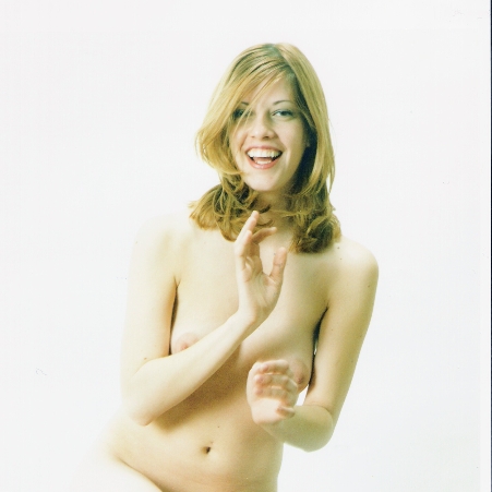


Joy!!
- Location
- My Studio - ipswich, MA. USA
- Equipment Used
- Hasselblad 503Cx - Dynalites
- Exposure
- 1/125th @ something like f/16.5
- Film & Developer
- Agfaclor 200, Tetenal C-41
- Paper & Developer
- IlfoColor, Tetenal RA-4
- Lens Filter
- None
| Photrio.com contains affiliate links to products. We may receive a commission for purchases made through these links. To read our full affiliate disclosure statement please click Here. |
PHOTRIO PARTNERS EQUALLY FUNDING OUR COMMUNITY:  |